
techanswers88
YouTube channel @ DataAnalytic
Recently Published

Create Date Table in R
Create a date table in R, which you can use in PowerBI or even in R.
Watch the YouTube Video for more information.

ScatterPlot Using GGPLOT with Trendline and marginal plots
ScatterPlot Using GGPLOT with Trendline and marginal plots

Titles in GGPLOT
Titles in GGPLOT
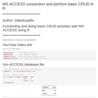
MS ACCESS Connection and CRUD using R
Learn how to make a connection to your MS ACCESS database file and perform the basic CRUD operations using R.
https://www.youtube.com/watch?v=5tvGGeJWIPM
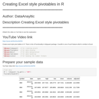
A great tool for creating pivot tables and a lot more for financial analysis.
this demo shows how you can create a excel style pivot table and also use the COUNT_IFS feature which is similar to Excel.
You can wath this script in action on YouTube https://youtu.be/5tvGGeJWIPM
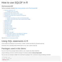
Using SQLDF in R to use SQL statements
You can make use of SQL statement using SQLDF package. This tutorial covers, select, update, delete, calculating various statistics, aggregarion of data by groups etc.
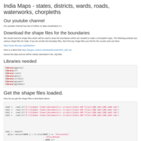
India Maps with States, Districts,Wards,Roads, Waterworks etc
Use shape files to draw India maps with States, Districts, Wards, Choropleth maps. Show Roads or Water works on the maps.
Data Validation in R
How to do data validation in r
DPLYR Full join command tuturial
DPLYR Full join command tuturial
Circle Packing Chart (Circular Treemap) in R
Circular Packing Chart (Circular Treemap) in R
DPLYR Inner join command tuturial
DPLYR Inner join command tuturial
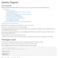
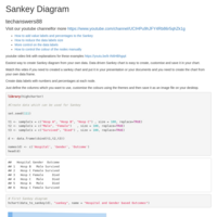
GGPLOT Sankey Chart showing responses to multiple choice question
This example shows how you can show the responses to a multiple choice question in GGPLOT Sankey Chart.
What population of Australians have been affected by the optus cyber attack
What population of Australians have been affected by the optus cyber attack
Ggplot side by side bar charts
Ggplot side by side bar charts
How to remove scientific notation in your axis in GGPLOT
How to remove scientific notation in your axis in GGPLOT
DPLYR Right join command tuturial
DPLYR Right join command tuturial
DPLYR Left join command tuturial
DPLYR Left join command tuturial
Waterfall chart using Waterfall package and GGPLOT
Waterfall chart using Waterfall package and GGPLOT
DPLYR CASE_WHEN command tuturial
This is part of the series of DPLYR series on our YouTube channel.
DPLYR CASE_WHEN command tuturial
DPLYR SLICE command tuturial
This video is part of the DPLYR Series YouTube. Go an watch the DPLYR Playlist for a complete introduction to DPLYR commands, step by step.
DPLYR Summarise command tuturial
DPLYR Summarise command tuturial
This is part of the series of tutorials on DPLYR
Visit the youtube playlist to watch https://www.youtube.com/playlist?list=PLkHcMTpvAaXVJzyRSytUn3nSK92TJphxR
DPLYR Mutate command tuturial
This is the dplyr Mutate command tutuorial, there is a complete series on youtube on different aspects of dplyr.
DPLYR Filter command tuturial
This is part of the series on Dplyr commands.
DPLYR Arrange command tuturial
DPLYR Arrange command tuturial
DPLYR Select command tuturial
This is a part of a series of tuturials on DPLYR in R
Gantt chart in R
Create this gantt chart in GGPLOT, no external libraries.
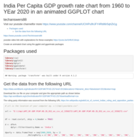
India per capita GDP growth rates in an animated chart.
A GGPLOT animated chart showing Indian per capita growth rates from 1960 to 2020.
sankey chart with your own data set in ggplot with data labels
sankey chart with your own data set in ggplot with data labels. Add frequency and percentages for each node in the data labels.
Learn to manually colour each node and also highlight a particular node.
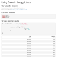
Manage dates in ggplot axis
We use the scale_x_date to manage the appearance of the dates in ggplot axis
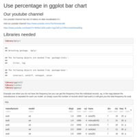
percentage in barcharts in ggplot
percentage in barcharts using ggplot
Ordered bar charts
Control the order of the bars in ggolot
Two axis in charts
Add a secondary axis to a chart
Multiple Line Charts in R
Two methods of drawing multiple line charts in R
How to validate your data fields using validate package in r
How to validate your data fields using validate package in r
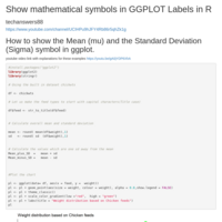
Scatter plot showing mathematical symbols in labels in R
Scatter plot showing mathematical symbols in labels in R
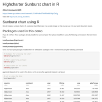
Easy Sankey diagram in Highcharter using R
Easy customised Sankey diagram in r using Highcharter package
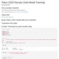
Olympics gold tally using ggmap
Olympics gold tally using ggmap
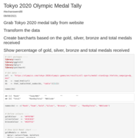
Tokyo 2020 Olympic medal tally charts in R
Tokyo 2020 Olympic medal tally charts in R
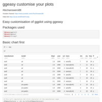
Easy customisation of charts using ggeasy
ggeasy makes it easy to customise your ggplot charts

Doughnut Chart using GGPLOt
Create Doughnut and pie chart using ggplot
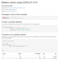
Battery Chart using GGPLOT
Battrey Chart in R using GGPLOT

after_stat to get percentage in ggplot
How to get the percentage in ggplot
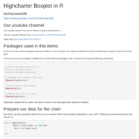
Highcharter Boxplot using R
Create Boxplot in R using Highcharter package.
Customise them and save them as static images.

Plotify Barcharts in R
Lear to create basic bar charts in R using Plotify package.
Learn to save them as interactive or static images.
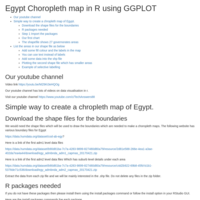
Egypt Choropleth map in R
Create a Chorpleth map for Egypt in r

Piechar using GGPLOT
Step by step instructions to create PIECHART in ggolot , with customisation and labelling options.
Choropleth map of Australia using ggplot in r
Simplest and fastest way to create Choropleth maps of Australia showing all states.
Heatmaps using GGPLOT
Learn to plot heatmaps in R using GGPLOT. Customisation of various aspects of the plot is explained as well.

T Test demistified
Practical usage of T Test in R
Calculate and Plot Rate of Change
Calculate and Plot Rate of Change in R
Vector Graphics Charts Using GGPLOT
Create Vector graphics charts in GGPLOT and manipulate in PowerPoint.
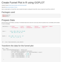
Funnel Plot in GGPLOT
Create funnel plot to represent proportional data in GGPLOT.
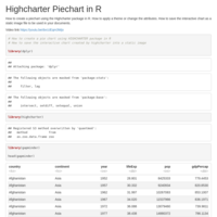
Easy piechart using Highcharter in R
Create and save a piechart using Highcharter in R
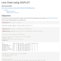
Line charts in GGPLOT
Line charts in GGPLOT. Watch the accompaniment youtube video for explanations.
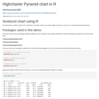
Pyramid Charts in R
Create Pyramid Charts in R using the Highcharter package.
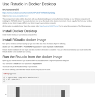
Rstudio docker on Docker Desktop
Tells you all about installing and running the Docker Desktop on your Windows computer and installing the RSTUDIO docker. You would also learn how to run the rstudio in the docker environment. How to copy the files from your windows desktop to your docker image and from your docker image to your windows computer.
Sunburst Charts in R
We will create a sunburst chart in R, customise it and then save it as a static image so that you can use it in your word document reports.
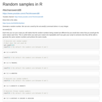
Generate samples in R
Different ways to generate random numbers in R.
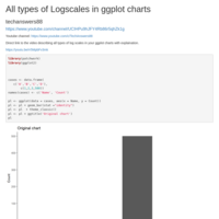
Logscales in ggplot
Explaination of creating different logscales in your ggplot charts in r.
Accompaniment video on youtube is available for easy understanding.
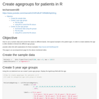
Creating different groups or bins based on numeric field data
One typical example is to create age groups based on patient ages.
Create agegroups in R using the Patients ages.
Barcharts in r using highcharter
An alternative to ggplot. You can use highcharter library to create interactive and static charts.
This document is accompanied by a youtube video for easy learning.
Subscribe to youtube channel https://www.youtube.com/c/TechAnswers88?s_confirmation=1
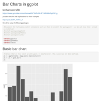
Basic Bar Charts in GGPLOT
All about bar charts, their positioning, customisation and applying themes and caption, labels and data labels.
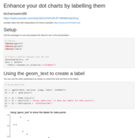
Enhance your dotplot by labelling them
How to label your dot plots, add colour,avoid overlapping.
How to selectively colour them based on a criteria.
Dotplot in ggplot
Learn to plot dotplots in ggplot and customise the colour, gradient, shape, text labels and positioning of the dots and labels.
Mean and Confidence Intervals calculations and charting
In this example we will calculate mean and the confidence intervals of a numerical column.
SQL Server connection and use from R
Leant to connect to the SQL Server from R.
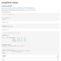
What is weighted mean
weighted mean
techanswers88
https://www.youtube.com/channel/UCIHPu9hJFY4Rb86r5qhZk1g
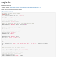
rsqlite in r
Learn how to create an in memory database. You can also use it for permanent(persistent) storage of your data on your computer.
No separate setup needed for installing the database. One line of code does it.

BoxPlots in GGPLOT
Learn to create boxplots in ggplot with lots of customisation options.
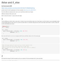
ifelse and if_else
techanswers88
https://www.youtube.com/channel/UCIHPu9hJFY4Rb86r5qhZk1g
youtube video link with explanations for these examples https://youtu.be/_2bbn2FG8To
Know the difference between both, how to use it and find out which one is faster.
Difference between ifelse and if_else
ifelse “comes from base r” if_else comes from dplyr
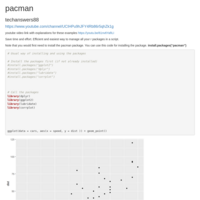
pacman
Save time and effort. Efficient and easiest way to manage all your r packages in a script.
R Treemaps
Easy step by step guide to create a Treemap and customise the look and feel of the chart.
Code updated and tested on 24 June 2022
Visit our youtube channel
"https://www.youtube.com/channel/UCIHPu9hJFY4Rb86r5qhZk1g"
youtube video link with explanations for these examples
https://youtu.be/Aw9WkpziVbI
Simple, practical and to the point explaination.
First we get the latest COVID19 data online.
Then we create a basic TREEMAP.
Then we customise the text which gets displayed in the treemap sections.
Then we create a palette of colours so that each section of the treemap can be filled in a different colour.
Lastly we add the title, subtitle to our treemap to make it ready for use in your documents.
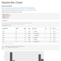
Stacked Barcharts in GGPLOT
youtube video link with explanations for these examples https://youtu.be/RPwJ6ExwPbg