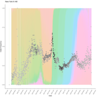
deanbobo
Dean Bobo
Recently Published


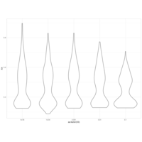
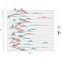
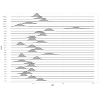
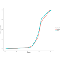
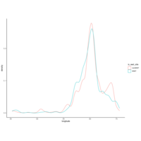
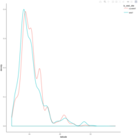
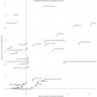
zoop_khill_density_ridges
(p<-node_khill %>%
mutate(genome_compressibility=khill/num_genomes) %>%
ggplot(aes(x=genome_compressibility, y=type, fill=type))+
geom_density_ridges(scale = 1.5, alpha = 0.7, color = "white")+
theme_classic()
)
ggplotly(p)


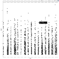
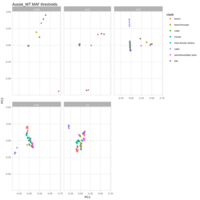
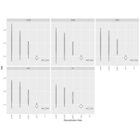
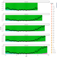
cohort1_bcftv2_num_sites_per_indv_gt_error1perc
Number of Sites Per Individual with # Minor Allele(s) Exceeding Error Rate (1%)


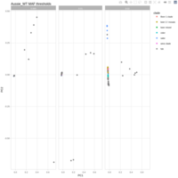
cohort1_bcftools_v1_mac_sum
number of sites per individual where minor allele count sum exceeds the expected error rate (1%)


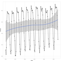
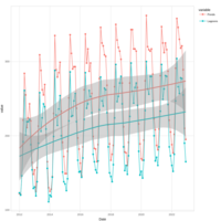
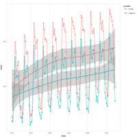
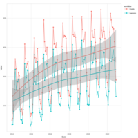
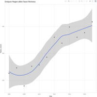
model1 qqplot
# mixed effect model for species richness over years
model1 <- lmer(
richness_scaled ~ observation_year_scaled * group_factored +
duration_minutes_sum_scaled +
num_localities_scaled +
num_birders_scaled +
num_checklists_scaled +
(1 | observation_month),
data = ebd_monthly_groups_summary
)


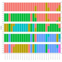
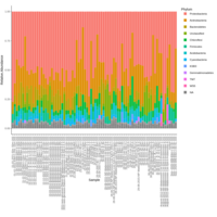
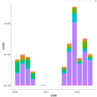
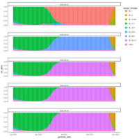
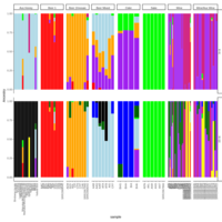
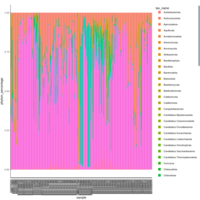
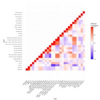
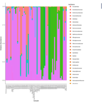
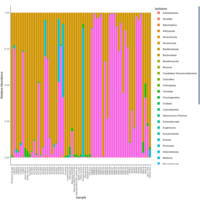
palleja_stacked_barchart_centrifuge_kraken
might want to redo it with bracken results


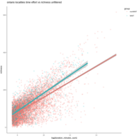


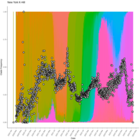
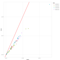

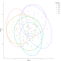
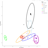
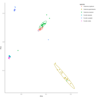
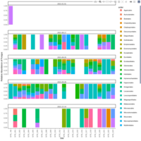
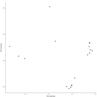
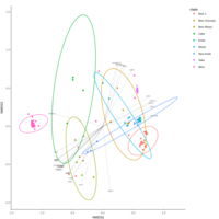
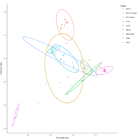
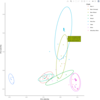
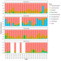
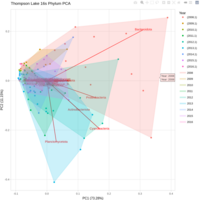
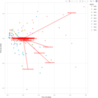
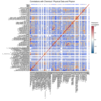
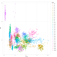
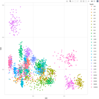
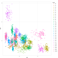
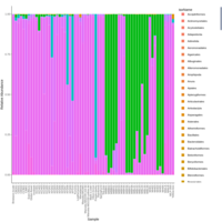
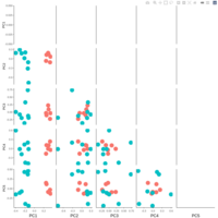
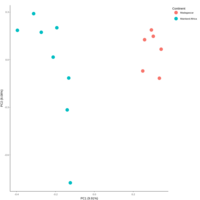
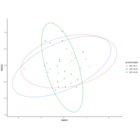
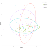
emiquon arisa with phychem data correlated
this plot is from unsummarized data. i.e. TT1, TT2, and TT3 were not averaged.
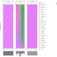
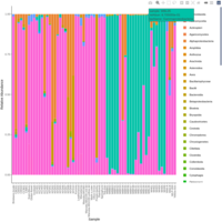
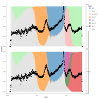
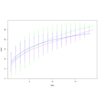
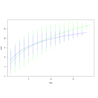
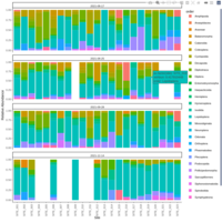
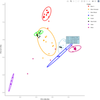
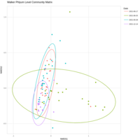
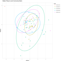
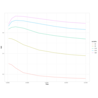
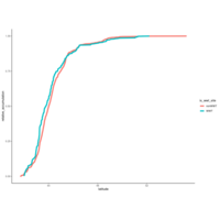
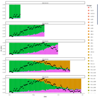
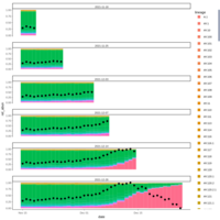
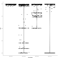
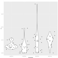
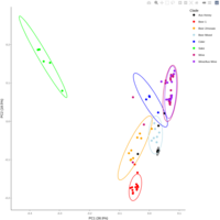
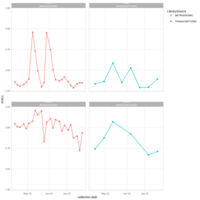
walker_bacteria_pre_post_accumulation_curve
green is pre flood. blue is post flood.
only vernal ponds included. (river and main wetland excluded)