
Gren
Renee
Recently Published
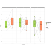
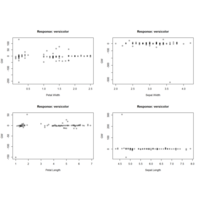
jitterdodgePlot
ggplot(mydata, aes(x = treatment, y = crp, fill = time)) +
stat_summary( fun.data = "mean_se",geom = "bar",
position = position_dodge(0.8), colour = "black", size = 0.3,width = 0.6) +
stat_summary( fun.data = "mean_se"..) +
geom_point(pch = 1,size = 2,colour = "black",
position = position_jitterdodge(0.6, 0.5, 0.8, seed = 111),
show.legend = FALSE) +geom_point( alpha = 0.6..) +
scale_fill_manual( values = c("#627980", "#48A1D5")) +
scale_y_continuous( expand = c(0, 0), limits = c(0, 10),
breaks = c(0, 2, 4, 6, 8, 10)) +
annotate("point", x = 2, y = 8.85, colour = "grey60", pch = 17, size = 2) +
labs( title = "",x = "",y = "CRP, mg/L")
geomAnnotatePlot
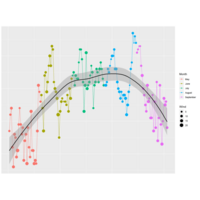
ggplot(mydata, aes(visits, scores, fill = visits)) + geom_line(aes(group = id), size = 0.2) +geom_point(shape = 21, size = 2.5, position = position_jitterdodge(jitter.width = 0.1, seed = 202), show.legend = FALSE) + scale_fill_manual(values = c("indianred2", "#48A1D5", "grey")) + theme_classic() + theme(axis.line = element_line(size = 0.2),axis.ticks = element_line(size = 0.2),.. + annotate("text", x = 2, y = 19.7, label = "**", size = 5) ... +coord_cartesian(expand = 0, ylim = c(0, 20), clip = "off") + labs( x = "", y = "Anxiety score (BL ≥ 10)")
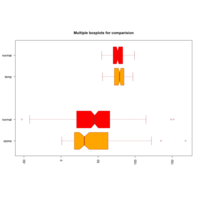
heterogeneousBoxPlot
boxplot(ozone, ozone_norm, temp, temp_norm,
main = "Multiple boxplots for comparision",
at = c(1,2,4,5),names = c("ozone", "normal", "temp", "normal"),
las = 2,col = c("wheat1","yellow3"),border = "brown",
horizontal = TRUE,notch = TRUE)
paquidLcmmPlot
predG1 <- predictY(m1, data_pred0, var.time = "age")
predG3 <- predictY(m3g, data_pred0, var.time = "age")
par(mfrow=c(1,3))
plot(predG1, col=1, lty=1, lwd=2, ylab="normMMSE", legend=NULL, main="Predicted trajectories G=1",ylim=c(0,100))
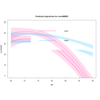
paquidlcmmPlot
predIC0 <- predictY(m2d, data_pred0, var.time = "age",draws=TRUE)
predIC1 <- predictY(m2d, data_pred1, var.time = "age",draws=TRUE)
plot(predIC0, col=c("deeppink","deepskyblue"), lty=1, lwd=2, ylab="normMMSE", main="Predicted trajectories for normMMSE", ylim=c(0,100), shades=TRUE)
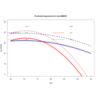
lcmmHlmePlot
pred0 <- predictY(m2d, data_pred0, var.time = "age")
pred1 <- predictY(m2d, data_pred1, var.time = "age")
plot(pred0, col=c("red","navy"), lty=1,lwd=5,ylab="normMMSE",legend=NULL, main="Predicted trajectories for normMMSE ",ylim=c(0,100))
plot(pred1, col=c("red","navy"), lty=2,lwd=3,legend=NULL,add=TRUE)
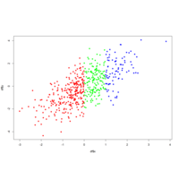
asFactorPlot
group <- as.factor(ifelse(x < 0.5, "Group 1", "Group 2"))
plot(x, y, pch = as.numeric(group), col = group)
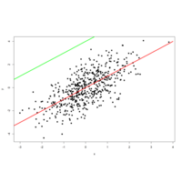
payoutablinePlot
par(mfrow = c(1, 1))
plot(x, y, pch = 19)
lines(-4:4, -4:4, lwd = 3, col = "red")
lines(-4:1, 0:5, lwd = 3, col = "green")
mfrowparPlot
my_ts <- ts(matrix(rnorm(500), nrow = 500, ncol = 1),
start = c(1950, 1), frequency = 12)

latex2expPlot
plot(x, y, main = expression(alpha[1] ^ 2 + frac(beta, 3)))
# install.packages("latex2exp")
library(latex2exp)
plot(x, y, main = TeX('$\\beta^3, \\beta \\in 1 \\ldots 10$'))
par(mfrow = c(1, 3))
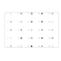
bchColPlot
plot(r, t, pch = 1:25, cex = 3, yaxt = "n", xaxt = "n",
ann = FALSE, xlim = c(3, 27), lwd = 1:3)
text(r - 1.5, t, 1:25)
plot(r, t, pch = 21:25, cex = 3, yaxt = "n", xaxt = "n", lwd = 3,
ann = FALSE, xlim = c(3, 27), bg = 1:25, col = rainbow(25))
dispersionDataPlot
lines(seq(0, 1, 0.05), 2 + 3 * seq(0, 1, 0.05)^2, col = "2", lwd = 3, lty = 2)
# Linear fit
abline(lm(y ~ x), col = "orange", lwd = 3)
# Smooth fit
lines(lowess(x, y), col = "blue", lwd = 3)
# Legend
legend("topleft", legend = c("Theoretical", "Linear", "Smooth"),
lwd = 3, lty = c(2, 1, 1), col = c("red", "orange", "blue"))
latex2Plot
library(latex2exp)
plot(x, y, main = TeX('$\\beta^3, \\beta \\in 1 \\ldots 10$'))
par(mfrow = c(1, 3))
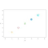
pchTtpePlot
plot(1:5, 1:5, pch = c("☺", "❤", "✌", "❄", "✈"),
col = c("orange", 2:5), cex = 3,
xlim = c(0, 6), ylim = c(0, 6))
plot(x, y, main = expression(alpha[1] ^ 2 + frac(beta, 3)))
sapplyPlot
j <- 0
invisible(sapply(seq(4, 40, by = 6),
function(i) {
j <<- j + 1
text(2, i, paste("lty =", j))}))
plot(x, y, main = "Main title", cex = 2, col = "blue")
hersheySymbolPlot
text(1, -4, "Other text", family = "HersheySymbol")
# Create dataframe with groups
group <- ifelse(x < 0 , "car", ifelse(x > 1, "plane", "boat"))
df <- data.frame(x = x, y = y, group = factor(group))
btyPlot
plot(x, y, bty = "n", main = "bty = 'n'")
par(mfrow = c(1, 1))
plot(x, y, pch = 19)
lines(-4:4, -4:4, lwd = 3, col = "red")
lines(-4:1, 0:5, lwd = 3, col = "green")
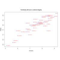
UJRTextPlot
text(FAMI, INTG,
labels = row.names(USJudgeRatings),
cex = 0.6, pos = 4, col = "red")
detach(USJudgeRatings)
attach(USJudgeRatings)
colorbyGroupPlot
plot(df$x, df$y, col = colors[df$group], pch = 16)
# Change color order, changing levels order
plot(df$x, df$y, col = colors[factor(group, levels = c("car", "boat", "plane"))],
pch = 16)
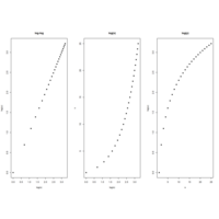
logShapePlot
plot(log(s), log(u), pch = 19,
main = "log-log")
# log(x)
plot(log(s), u, pch = 19,
main = "log(x)")
# log(y)
plot(s, log(u), pch = 19,
main = "log(y)")
par(mfrow = c(1, 1))
dotTypePlot
r <- c(sapply(seq(5, 25, 5), function(i) rep(i, 5)))
t <- rep(seq(25, 5, -5), 5)
plot(r, t, pch = 1:25, cex = 3, yaxt = "n", xaxt = "n",
ann = FALSE, xlim = c(3, 27), lwd = 1:3)
text(r - 1.5, t, 1:25)
parmfrowPlot
plot(my_dates, rnorm(50), main = "Time based plot")
# Plot R function
plot(fun, 0, 10, main = "Plot a function"
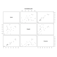
# Correlation plot
plot(trees[, 1:3], main = "Correlation plot")
par(mfrow = c(1, 1))
girthCorrelatePlot
my_ts <- ts(matrix(rnorm(500), nrow = 500, ncol = 1),
start = c(1950, 1), frequency = 12)
my_dates <- seq(as.Date("2005/1/1"), by = "month", length = 50)
my_factor <- factor(mtcars$cyl)
miniBasicPlot
set.seed(1)
# Generate sample data
x <- rnorm(500)
y <- x + rnorm(500)
# Plot the data
plot(x, y)
# Equivalent
M <- cbind(x, y)
plot(M)
loopBloackPlot
for(i in 1:(ncol(iris) - 1)) { # Head of for-loop
plot(1:nrow(iris), iris[ , i]) # Code block
Sys.sleep(1) # Pause code execution
}
boxPlot
main = "Multiple boxplots for comparision",
at = c(1,2,4,5),
names = c("ozone", "normal", "temp", "normal"),
las = 2,
col = c("orange","red"),
border = "brown",
horizontal = TRUE,
notch = TRUE
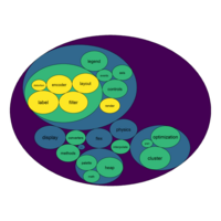
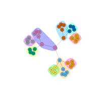
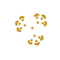
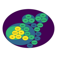
bubbleProportionPlot
mygraph <- graph_from_data_frame( edges, vertices=vertices )
# left
ggraph(mygraph, layout = 'circlepack', weight=size ) +
geom_node_circle(aes(fill = depth)) +
geom_node_text( aes(label=shortName, filter=leaf, fill=depth, size=size)) +
theme_void() +
theme(legend.position="FALSE") +
scale_fill_viridis()
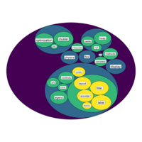
virdisBubblePlot
ggraph(mygraph, layout = 'circlepack', weight=size ) +
geom_node_circle(aes(fill = depth)) +
geom_node_label( aes(label=shortName, filter=leaf, size=size)) +
theme_void() +
theme(legend.position="FALSE") +
scale_fill_viridis()
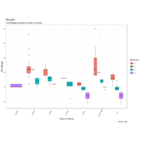
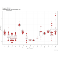
boxAesPlot
library(ggthemes)
g <- ggplot(mpg, aes(class, cty))
g + geom_boxplot(aes(fill=factor(cyl))) +
theme(axis.text.x = element_text(angle=65, vjust=0.6)) +
labs(title="Box plot",
subtitle="City Mileage grouped by Class of vehicle",
caption="Source: mpg",
x="Class of Vehicle",
y="City Mileage")
boxplotWithDotPlot
library(ggplot2)
theme_set(theme_bw())
# plot
g <- ggplot(mpg, aes(manufacturer, cty))
g + geom_boxplot() +
geom_dotplot(binaxis='y', stackdir='center',
dotsize = .5, fill="red") +
theme(axis.text.x = element_text(angle=65, vjust=0.6)) +
labs(title="Box plot + Dot plot",
subtitle="CEach dot represents 1 row",
caption="Source: mpg",
x="Class of Vehicle",
y="City Mileage")
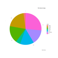
pieChartPlot
library(ggplot2)
theme_set(theme_classic())
# Source: Categorical variable.
# mpg$class
pie <- ggplot(mpg, aes(x = "", fill = factor(class))) +
geom_bar(width = 1) +
theme(axis.line = element_blank(),
plot.title = element_text(hjust=0.5)) +
labs(fill="class", x=NULL, y=NULL,
title="Pie Chart of class",
caption="Source: mpg")
pie + coord_polar(theta = "y", start=0)

viloinPlot
library(ggplot2)
theme_set(theme_bw())
# plot
g <- ggplot(mpg, aes(class, cty))
g + geom_violin() +
labs(title="Violin plot",
subtitle="City Mileage vs Class of vehicle",
caption="Source: mpg",
x="Class of Vehicle",
y="City Mileage")
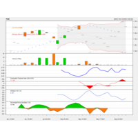
quantmodPABPlot
library(quantmod)
getSymbols("PAB",src="yahoo")
chartSeries(PAB,subset = "2020-07-01::2021-05-27", theme = "white")
chartTheme("white")
addATR()
addBBands(n=14,sd=2)
addCCI()#SPSS Index
addWPR()#William Index
addSAR()#stopandReverse index
addDPO()#RangFlctuateIndex
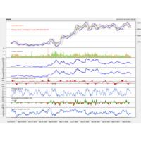
quantmodAPlot
#AMZNCase
library(quantmod)
getSymbols("AMZN",src="yahoo")
chartSeries(AMZN,subset = "2019-07-01::2021-05-27",theme="white")
addATR()
addBBands(n=14,sd=2)
addCCI()#SPSS Index
addWPR()#William Index
addSAR()#stopandReverse index
addDPO()#RangFlctuateIndex
addRSI()#CompareSW Index
sankeyPlotHTML
fig <- plot_ly(
type = "sankey",
domain = list(
x = c(0,1),
y = c(0,1)
),
orientation = "h",
valueformat = ".0f",
valuesuffix = "TWh",
node = list(
label = json_data$data[[1]]$node$label,
color = json_data$data[[1]]$node$color,
pad = 15,
thickness = 15,
line = list(
color = "black",
width = 0.5
)
),
link = list(
source = json_data$data[[1]]$link$source...
)
forecastSankeyHTML
json_file <- "https://..mocks/sankey_energy.json" json
data <- fromJSON(paste(readLines (json_file), collapse=""))
fig <- plot_ly( type = "sankey", orientation = "h", valueformat = ".0f", valuesuffix = "TWh", ..
fig <- fig %>% layout( title = "Energy forecast for 2050
<br>Source: DC, Tom Counsell via <a href='https://bost.ocks.org/mike/sankey/'>Mike Bostock</a>", font = list( size = 10 ), xaxis = list(showgrid = F, zeroline = F), yaxis = list(showgrid = F, zeroline = F) )
polymorphismSankeyHTML
links$IDsource <- match(links$source, nodes$name)-1
links$IDtarget <- match(links$target, nodes$name)-1
# Make the Network
p <- sankeyNetwork(Links = links, Nodes = nodes,
Source = "IDsource", Target = "IDtarget",
Value = "value", NodeID = "name",
sinksRight=FALSE)
simplSankeyHTML
nodes <- data.frame(
name=c(as.character(links$source),
as.character(links$target)) %>% unique()
)
links$IDsource <- match(links$source, nodes$name)-1
links$IDtarget <- match(links$target, nodes$name)-1
# Make the Network
p <- sankeyNetwork(Links = links, Nodes = nodes,
Source = "IDsource", Target = "IDtarget",
Value = "value", NodeID = "name",
sinksRight=FALSE)
sankeyNodeHTML
fig <- plot_ly(
type = "sankey",
arrangement = "snap",
node = list(
label = c("A", "B", "C", "D", "E", "F"),
x = c(0.2, 0.1, 0.5, 0.7, 0.3, 0.5),
y = c(0.7, 0.5, 0.2, 0.4, 0.2, 0.3),
pad = 10), # 10 Pixel
link = list(
source = c(0, 0, 1, 2, 5, 4, 3, 5),
target = c(5, 3, 4, 3, 0, 2, 2, 3),
value = c(1, 2, 1, 1, 1, 1, 1, 2)))
fig <- fig %>% layout(title = "Sankey with manually positioned node")
sankeyHTML
fig <- fig %>% layout(
title = "Energy forecast for 2050<br>Source: Department of Energy & Climate Change, Tom Counsell via <a href='https://bost.ocks.org/mike/sankey/'>Mike Bostock</a>",
font = list(
size = 10,
color = 'white'
),
xaxis = list(showgrid = F, zeroline = F, showticklabels = F),
yaxis = list(showgrid = F, zeroline = F, showticklabels = F),
plot_bgcolor = 'black',
paper_bgcolor = 'black'
)
fig
sankeyChart1HTML
fig <- plot_ly(
type = "sankey",
domain = list(
x = c(0,1),
y = c(0,1)
),
orientation = "h",
valueformat = ".0f",
valuesuffix = "TWh",
node = list(
label = json_data$data[[1]]$node$label,
color = json_data$data[[1]]$node$color,
pad = 15,
thickness = 15,
line = list(
color = "black",
width = 0.5
)
),
link = list(
source = json_data$data[[1]]$link$source,
target = json_data$data[[1]]$link$target,
value = json_data$data[[1]]$link$value,
label = json_data$data[[1]]$link$label
)
)
sankeyNetworkHTML
Sankey.p <- sankeyNetwork(Links = df, Nodes = df.nodes,
Source = "IDsource", Target = "IDtarget",
Value = "value", NodeID = "name", LinkGroup = "group",colourScale=my_color,
sinksRight=FALSE, nodeWidth=25, nodePadding=10, fontSize=13,width=900)
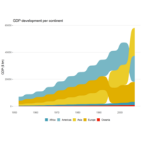
sankeybumpPlot
geom_sankey_bump(space = 0, type = "alluvial",
color = "transparent", smooth = 6) +
scale_fill_manual(values = colors)+
theme_sankey_bump(base_size = 16) +
labs(x = NULL,
y = "GDP ($ bn)",
fill = NULL,
color = NULL) +
theme(legend.position = "bottom") +
labs(title = "GDP/p")
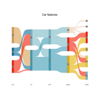
sankyDiagram
ggplot(df, aes(x = x, next_x = next_x,
node = node, next_node = next_node,
fill = factor(node), label = node)) +
geom_sankey(flow.alpha = .6,
node.color = "gray30") +
geom_sankey_label(size = 3, color = "white", fill = "gray40") +
scale_fill_manual(values = colors)+
theme_sankey(base_size = 18) +
labs(x = NULL) +
theme(legend.position = "none",
plot.title = element_text(hjust = .5)) +
ggtitle("Carfeatures")
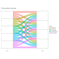
phlyumPlot
ggplot(data = melt_df,
aes(axis1 = Phylum, axis2 = variable,
weight = value)) +
scale_x_discrete(limits = c("Phylum", "variable"), expand = c(.1, .05)) +
geom_alluvium(aes(fill = Phylum)) +
geom_stratum() + geom_text(stat = "stratum", label.strata = TRUE) +
theme_minimal() +
ggtitle("Phlyum abundance in each group")
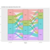
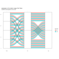
vaccianationsPlot
data(vaccinations)
levels(vaccinations$response) <- rev(levels(vaccinations$response))
ggplot(vaccinations,
aes(x = survey, stratum = response, alluvium = subject,
weight = freq,
fill = response, label = response)) +
geom_flow() +
geom_stratum(alpha = .5) +
geom_text(stat = "stratum", size = 3) +
theme(legend.position = "none") +
ggtitle("vaccination survey responses at three points in time")
alluviumPlot
data(majors)
majors$curriculum <- as.factor(majors$curriculum)
ggplot(majors,
aes(x = semester, stratum = curriculum, alluvium = student,
fill = curriculum, label = curriculum)) +
scale_fill_brewer(type = "qual", palette = "Set2") +
geom_flow(stat = "alluvium", lode.guidance = "rightleft",
color = "darkgray") +
geom_stratum() +
theme(legend.position = "bottom") +
ggtitle("student curricula across several semesters")
alluviaPlot
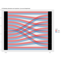
is_alluvial(as.data.frame(UCBAdmissions), logical = FALSE, silent = TRUE)
ggplot(as.data.frame(UCBAdmissions),
aes(weight = Freq, axis1 = Gender, axis2 = Dept)) +
geom_alluvium(aes(fill = Admit), width = 1/12) +
geom_stratum(width = 1/12, fill = "black", color = "grey") +
geom_label(stat = "stratum", label.strata = TRUE) +
scale_x_continuous(breaks = 1:2, labels = c("Gender", "Dept")) +
scale_fill_brewer(type = "qual", palette = "Set1") +
ggtitle("UC Berkeley")
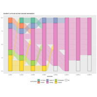
ggalluviumPlot
ggplot(data = t_wide,aes(axis1 = Class, axis2 = Sex, axis3 = Age,
weight = Freq)) +scale_x_discrete(limits = c("Class", "Sex", "Age"), expand = c(.1, .05)) +
geom_alluvium(aes(fill = Survived)) +
geom_stratum() + geom_text(stat = "stratum", label.strata = TRUE) +
theme_minimal() +
ggtitle("p","demographics and survival")
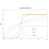
dweillPweibullPlot
plot(x,y,col="red",xlim=c(0,2.5),
ylim=c(0,1.2),
type="l", xaxs="i",
yaxs="i",ylab='density',
xlab='',main="WeibullCummulative")
lines(x,pweibull(x,1),type="l", col="purple")
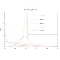
weibullDisPlot
x<-seq(0,2.5,length.out = 1000)
y<-dweibull(x,0.5) # e^0.5
plot(x,y,col="red",xlim=c(0,2.5),
ylim=c(0,6),type="l", xaxs="i",
yaxs="i",ylab='density',
xlab='',main="WeibullDens")
lines(x,dweibull(x,1),type="l", col="red")
gammaDisPlot
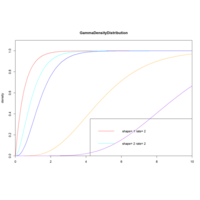
y<-pgamma(x,1,2) # e^0.5
plot(x,y,col="red",xlim=c(0,10),
ylim=c(0,1),type="l",
xaxs="i",yaxs="i",ylab='density',
xlab='',main="GammaDen")
lines(x,pgamma(x,1,2),col="red")...
gammaDenDisPlot
x<-seq(0,10,length.out=100)
y<-dexp(x,1,2) # e^0.5
plot(x,y,col="red",xlim=c(0,10),ylim=c(0,2),
type="l", xaxs="i",yaxs="i",ylab='density',
xlab='',main="Gamma")
lines(x,dgamma(x,1,2),col="red")..
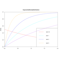
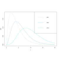
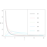
dexpPexpPlot
x<-seq(-1,2,length.out=100)
y<-dexp(x,0.5) # e^0.5
plot(x,y,col="red",xlim=c(0,2),ylim=c(0,1),
type="l", xaxs="i",yaxs="i",ylab='density',
xlab='',main="ExponentialCumulative")
lines(x,pexp(x,1),col="cyan")
...
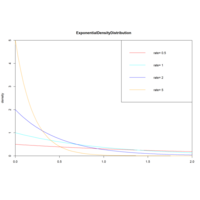
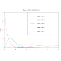
exponentialDenDisPlot
x<-seq(-1,2,length.out=100)
y<-dexp(x,0.5) # e^0.5
plot(x,y,col="red",xlim=c(0,2),ylim=c(0,5),
type="l", xaxs="i",yaxs="i",ylab='density',
xlab='',main="Exponential")
lines(x,dexp(x,1),col="cyan")..
legend("topright", legend=paste("rate=", c(.5,1,2,5)),
lwd=1,col=c())
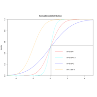
ncumuDistriPlot
plot(x,y,col="red",xlim=c(-5,5),ylim=c(0,1),
type="l", xaxs="i",yaxs="i",ylab='density',
xlab='',main="NormalDensityDistribution")
lines(x,pnorm(x,0,0.5),col="cyan")..
legend("bottomright", legend=paste("m=",c(0,0,0,-2),
"sd=", c(1,0.5,2,1)),
lwd=1,col=c())
#Shapiro-Wilk test
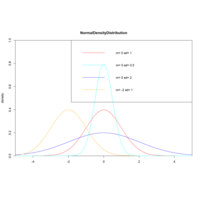
normDistriPlot
x<-seq(-5,5,length.out=100)
y<-dnorm(x,0,1)
plot(x,y,col="red",xlim=c(-5,5),ylim=c(0,1),
type="l", xaxs="i",yaxs="i",ylab='density',
xlab='',main="NormalDensityDistribution")
lines(x,dnorm(x,0,0.5),col="cyan")..
legend("topright", legend=paste("m=",c(0,0,0,-2),
"sd=", c(1,0.5,2,1)),
lwd=1,col=c())
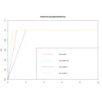
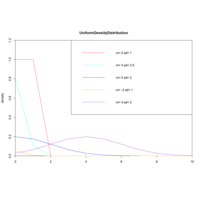
UnifcumulDisFPlot
set.seed(1) y<-punif(x,0,1)
x<-seq(0,10,length.out=1000)
plot(x,y,col="red",xlim=c(0,10),ylim=c(0,1.2),
type="l", xaxs="i",yaxs="i",ylab='F(x)',
xlab='',main="Unif")
lines(x,punif(x,0,0.5),col="cyan")..
legend("bottomright",
legend=paste("m=",c(0,0,0,-2),
"sd=", c(1,0.5,2,1)), lwd=1,col=c())
uniformDenDistPlot
set.seed(1)x<-seq(0,10,legth.out=1000)
y<-dunif(x,0,1)
plot(x,y,col="red",xlim=c(0,10),ylim=c(0,1.2),
type="l", xaxs="i",yaxs="i",ylab='density',
xlab='',main="UniformDensityDist")
lines(x,dnorm(x,0,0.5),col="cyan")..
legend("topright", legend=paste
("m=",c(0,0,0,-2,4), "sd=", c(1,0.5,2,1,2)),
lwd=1,col=c())
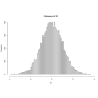
PerfomanceAnalyticsPlot
S1<-rnorm(10000)
skewness(S1)
hist(S1,breaks=100)
kurtosis(S1)
x<-as.data.frame(matrix(rnorm(10),ncol=2))
cov(x)
arcsincostanPlot
g<-ggplot(df,aes(x,y))
g<-g+geom_line(aes(colour=type, stat='identity'))
#g<-g+scale_y_continuous(limits = c(-2,2))
g<-g+scale_y_continuous(limits=c(-2*pi,2*pi),
breaks=seq(-2*pi,2*pi,by=pi),
labels=c("-2*pi","-pi","0","pi","2*pi"))
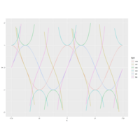
cscseccotPlot
x<-seq(-2*pi,2*pi,by=0.1)..
s6<-data.frame(x,y=1/sin(x),type=rep('csc',length(x)))
df<-rbind(s1,s2,s3,s4,s5,s6) g<-ggplot(df,aes(x,y))
g<-g+geom_line(aes(colour=type, stat='identity'))
g<-g+scale_y_continuous(limits = c(-2,2))
g<-g+scale_x_continuous(breaks
=seq(-2*pi,2*pi,by=pi),
labels=c("-2*pi","-pi","0","pi","2*pi"))
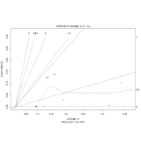
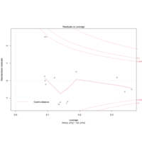
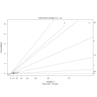
leveResidualsDisPlot
param <- length(coef(mod.1))
yhat.full <- fitted(mod.1)
sigma <- summary(mod.1)$sigma
cooks <- rep(NA,n)
for(i in 1:n){
temp.y <- y1[-i]
temp.x <- x1[-i]
temp.model <- lm(temp.y~temp.x)
temp.fitted <- predict(temp.model,
newdata=data.frame(temp.x=x1))
cooks[i] <- sum((yhat.full-temp.fitted)^2)/
(param*sigma^2)
}
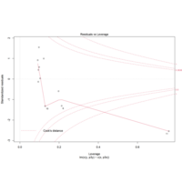
ablineSPlot
abline(h=c(1,4/n),lty=2)
plot(mod.1,which=5,add.smooth=T,
cook.levels=c(4/11,0.5,1))
plot(mod.2,which=5,add.smooth=T,cook.
levels=c(4/11,0.5,1))
plot(mod.2,which=5,add.smooth=FALSE,
cook.levels=c(4/11,0.5,1))
plot(mod.3,which=5,add.smooth=FALSE,
cook.levels=c(4/11,0.5,1))
addSmoothPlot
yhat.full <- fitted(mod.1)
sigma <- summary(mod.1)$sigma
cooks <- rep(NA,n)
for(i in 1:n){
temp.y <- y1[-i]
temp.x <- x1[-i]
temp.model <- lm(temp.y~temp.x)
temp.fitted <- predict(temp.model,
newdata=data.frame(temp.x=x1))
cooks[i] <- sum((yhat.full-temp.fitted)^2)
/(param*sigma^2)
}
sigmaPlot
yhat.full <- fitted(mod.1)
sigma <- summary(mod.1)$sigma
cooks <- rep(NA,n)
for(i in 1:n){
temp.y <- y1[-i]
temp.x <- x1[-i]
temp.model <- lm(temp.y~temp.x)
temp.fitted <- predict(temp.model,newdata=data.frame(temp.x=x1))
cooks[i] <- sum((yhat.full-temp.fitted)^2)/(param*sigma^2)
}
aesPlot
gg1 <- ggplot(air,aes(x=1:nrow(air),
y=Temp)) +
geom_line(aes(col=Month)) +
geom_point(aes(col=Month,
size=Wind)) +
geom_smooth(method="loess",
col="black") +
labs(x="Time (days)",y="Tem")

kernelDensityPlot
air$Month <- factor(air$Month,labels=c()
ggplot(data=air,aes(x=Temp,fill=Month)) +
geom_density(alpha=0.4) + ggtitle("") +
labs(x="",y="")
gg1 <- ggplot(air,aes(x=1:nrow(air),
y=Temp)) +geom_line(aes(col=Month))
+geom_point(aes(col=Month,size=Wind))
+geom_smooth(method="loess",
col="black") )
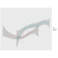
rcombinePlot
sm <- predict(smoother,newdata=
data.frame(Wr.Hnd=handseq))
lines(handseq,sm$fit)
polygon(x=c(handseq,rev(handseq)),
y=c(sm$fit+2*sm$se,rev(sm$fit-2*sm$se)),
col=adjustcolor("gray",alpha.f=0.5))
ggplot(surv,aes(x=Wr.Hnd,y=Height,
col=Sex,shape=Sex)) +
geom_point() + geom_smooth
(method="loess")
loesslinesPlot
smoother <- loess(Height~Wr.Hnd,
data=surv)
handseq <- seq(min(surv$Wr.Hnd),
max(surv$Wr.Hnd), length=100)
sm <- predict(smoother,newdata=data.frame
(Wr.Hnd=handseq),lines(handseq,sm$fit)
polygon(x=c(handseq,rev(handseq)),
y=c(sm$fit+2*sm$se,rev(sm$fit-2*sm$se))
geomvlinePlot
gg.lines<- geom_vline(mapping=
aes(xintercept=mm,linetype=stats),
data=mtcars.mm)
gg.static + geom_histogram(color="black",
fill="white",breaks=seq(0,400,25),
closed="right") + gg.lines +
scale_linetype_manual(values=c(2,3)) +
labs(linetype="")
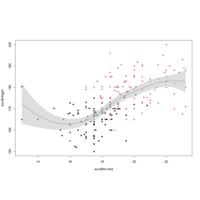
geomsmoothPlot
surv <- na.omit(survey[,c("Fac",
"Wr.Hnd", "Height")])
ggplot(surv,aes(x=Wr.Hnd,y=Height)) +
geom_point(aes(col=Sex,shape=Sex)) +
geom_smooth(method="loess")
plot(surv$Wr.Hnd,surv$Height,col=surv$Sex,
pch=c(16,17)[surv$Sex])
smoother <- loess(Height~Wr.Hnd,data=surv)
packCirclePlot
sizes <-rnorm(50, mean = 20, sd = 10)
position <- pack_circles(sizes)
data <- data.frame(x = position[,1], y = position[,2], r = sqrt(sizes/pi))
ggplot(data)+geom_circle(aes(x0 = 0, y0 = 0, r = attr(position, 'enclosing_radius')*0.88), size=1)+
geom_circle(aes(x0 = x, y0 = y, r = r, fill=r), data = data)+
geom_text(aes(x=x, y=y, label=label, size=r))+
scale_fill_distiller(palette='Spectral', name='value')
scatter3DPlot
with(iris,scatter3D(x = Sepal.Length,y = Sepal.Width,
z = Petal.Length,pch = 21,cex = 1.5,col="black",
bg=colors,xlab = "longitude",ylab = "latitude",
zlab = "depth,km",ticktype = "detailed",bty = "f",
box = TRUE,theta = 140,phi = 20,d=3, colkey = FALSE))
legend("right",title="Species",legend=
c("setosa","versicolor","virginica"),pch=21,
cex=1,y.intersp=1,pt.bg = colors0,bg="white",bty="n")
slice3DPlot
R <- with(M, sqrt(x^2 + y^2 + z^2))
p <- sin(2*R)/(R+1e-3)
colormap <- colorRampPalette(rev(brewer.pal(11, 'Spectral'))
slice3D(x, y, z, colvar = p, facets = FALSE,
col = ramp.col(colormap, alpha = 0.9),
clab="p vlaue",xs = 0, ys = c(-4, 0, 4), zs = NULL,
ticktype = "detailed", bty = "f", theta = -120, phi = 30, d=3,
colkey = list(length = 0.5, width = 1, cex.clab = 1))
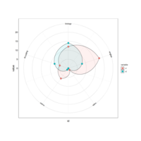
bpwlBezier
geom_bezier(data= df_bezier, aes(x= treatment, y = value, group = index, linetype = 'cubic'),
size=0.25, colour="grey20")+
scale_fill_manual(values=brewer.pal(7, "Set2")[c(5,2)])+
facet_grid(.~class)+
labs(x="treatment", y="Value")+
theme_light()
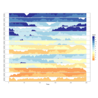
geomhorizontaltsPlot
geom_horizon(colour=NA, size=0.25, bandwidth=10)+
facet_wrap(~variable, ncol = 1, strip.position = "left")+
scale_fill_manual(values=colormap)+
xlab('Time')+ ylab('')+ theme_bw()+
theme(strip.background = element_blank(),
strip.text.y = element_text(hjust=0, angle=180, size=10),
gridArrangescaPlot
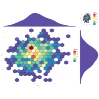
scatter<-ggplot(data, aes(x, y))+
#stat_density2d(geom ="polygon", aes(fill = ..level..), bins=30)+
stat_binhex(bins = 15, na.rm=TRUE, color="black")+#
scale_fill_gradientn(colours=Colormap)+
theme_minimal()
grid.arrange(hist_top, scatter, scatter, hist_right, ncol=2, nrow=2, widths=c(4,1), heights=c(1,4))
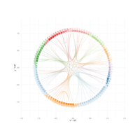
igraphPlot
mygraph <- graph_from_data_frame(edges, vertices=vertices)
all_leaves<-paste("subgroup", seq(1,100), sep="_"..
from<-match(connect$from, vertices$name)
to <- match(connect$to, vertices$name)
ggraph(mygraph, layout = 'dendrogram', circular = TRUE)+
geom_node_point(aes(filter = leaf, x = x*1.07, y=y*1.07, fill=group, size=value), alpha=0.8, shape=21, stroke=0.2)..
stardplyrPlot
stars(dstar[,2:6], key.loc = c(-2, 10), scale = TRUE,
locations = NULL, len =1, radius = TRUE,
full = TRUE, labels = NULL, draw.segments = TRUE,
col.segments=palette(brewer.pal(7, "Set1"))[1:5])
loc <- data.matrix(dstar[,11:12])
stars(dstar[,2:6], key.loc = c(-1, 3), scale = TRUE,
locations = loc, len =0.07, radius = TRUE,
colpheatmapPlot
breaks <- seq(min(unlist(c(df1, df2))), max(unlist(c(df1, df2))), length.out=100)
p1<- pheatmap(df1, color=Colormap, breaks=breaks, border_color="black", legend=TRUE)
p2 <- pheatmap(df2, color=Colormap, breaks=breaks, border_color="black", legend=TRUE)
plot_grid(p1$gtable, p2$gtable, align = 'vh', labels = c("A", "B"), ncol = 2)
pheatmapPlot
colormap <- colorRampPalette(rev(brewer.pal(n = 7, name = "RdYlBu")))(100) breaks = seq(min(unlist(c(df))), max(unlist(c(df))), length.out=100)
df<-scale(mtcars)
pheatmap(df, color=colormap, breaks=breaks, border_color="black",
cutree_col = 2, cutree_row = 4)
tsnePlot
tsne_out <- Rtsne(as.matrix(iris_unique[,1:4]))
mydata<-data.frame(tsne_out$Y, iris_unique$Species)
colnames(mydata)<-c("t_DistributedY1", "t_DistributedY2", "Group")
ggplot(data=mydata, aes(t_DistributedY1, t_DistributedY2, fill=Group))+
geom_point(size=4, colour="black", alpha=0.7, shape=21)+
scale_fill_manual(values=c("#00AFBB", "#FC4E07", "#E7B800", "#2E9FDF"))
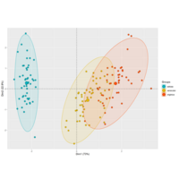
PrincipalComponentsAnalysis
iris.pca<-PCA(df, graph = FALSE)
fviz_pca_ind(iris.pca,
geom.ind = "point",
pointsize =3, pointshape = 21, fill.ind = iris$Species, # color by groups
palette = c("#00AFBB", "#E7B800", "#FC4E07"),
addEllipses = TRUE, # Concentration ellipses
legend.title = "Groups",
title="")+theme_grey()
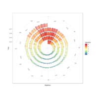
spiralTimeseriesPlot
dtData$Asst<-rep(Step, nrow(dtData))
YearRange<-unique(dtData$Year)
for(i in 1:length(YearRange)){
dtData$Asst[dtData$Year==YearRange[i]]<-seq(i*Step,
(i+1)*Step,
length.out = length(dtData$Asst
[dtData$Year==YearRange[i]]))}
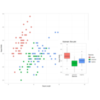
submainPlot
p2 <-ggplot(iris, aes(Species, Sepal.Width, fill = Species))+
geom_boxplot()+
theme_bw()+
ggtitle("Submain: Box plot")+
theme_light()
subvp <-viewport(x = 0.78, y = 0.38, width = 0.4, height = 0.5)
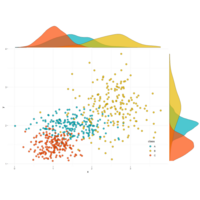
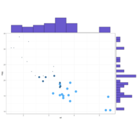
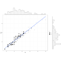
ggscatterPlot
ggscatterhist(
data2, x='x', y='y',
shape=21, color ="black", fill= "class", size =3, alpha = 0.8,
palette = c("#00AFBB", "#E7B800", "#FC4E07"),
margin.plot= "density",
margin.params = list(fill = "class", color = "black", size = 0.2),
legend = c(0.9,0.15),
ggtheme = theme_minimal())
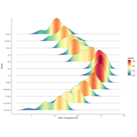
ggridgePlot
ggplot(lincoln_weather, aes(x = `Mean Temperature [F]`, y = `Month`, fill = ..density..))+
geom_density_ridges_gradient(scale = 3, rel_min_height = 0.00, size = 0.3)+
scale_fill_gradientn(colours = colorRampPalette(rev(brewer.pal(11, 'Spectral')))(32))
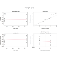
lmgroupPlot
group <- gl(2, 10, 20, labels = c("Ctl","Trt"))
weight <- c(ctl, trt)
lm.D9 <- lm(weight ~ group)
lm.D90 <- lm(weight ~ group - 1) # omitting intercept
anova(lm.D9)
summary(lm.D90)
opar <- par(mfrow = c(2,2), oma = c(0, 0, 1.1, 0))
plot(lm.D9, las = 1) # Residuals, Fitted, ...
par(opar)
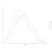
densityfactPlot
qplot(Wind, data=airquality, facets = .~Month)
qplot(y=Wind, data=airquality)
qplot(Wind, data = airquality, fill = Month)
qplot(Wind, data=airquality, geom="density",
color=Month)
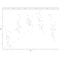
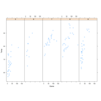
columFactorPlot
qplot(Wind, Temp, data=airquality,
facets = .~Month)
qplot(Wind, Temp, data=airquality,
facets = Month~.)
qplot(Wind, data=airquality, facets = Month~.)
qplot(Wind, data=airquality, facets = .~Month)
qplot(y=Wind, data=airquality)
fillFrequencyPlot
qplot(Wind, Temp, data=airquality,
facets = .~Month)
qplot(Wind, Temp, data=airquality,
facets = Month~.)
qplot(Wind, data=airquality, facets = Month~.)
qplot(y=Wind, data=airquality)
rowfactorPlot
qplot(Wind, Temp, data=airquality,
facets = .~Month)
qplot(Wind, Temp, data=airquality,
facets = Month~.)
qplot(Wind, data=airquality, facets = Month~.)
qplot(y=Wind, data=airquality)
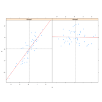
smoothPlot
qplot(Wind, Temp, data=airquality,color=Month,
geom = c("point", "smooth"))
qplot(Wind, Temp, data=airquality,
facets = .~Month)
qplot(Wind, Temp, data=airquality,
facets = Month~.)
shapeFactorPlot
qplot(Wind, Temp, data=airquality, color=Month,
xlab="Wind(mph)", ylab="Temprature",
main="Wind vs. Temp")
facetgridPlot
myColors <- c(brewer.pal(5, "Dark2"), "black")
display.brewer.pal(5, "Dark2")
ggplot(airquality, aes(Wind,Temp,
col=factor(Month))) +
geom_point() +
stat_smooth(method = "lm", se=FALSE) +
scale_color_manual("Month", values = myColors)
facet_grid(.~Month)
theme_classic()
scalecolorPlot
display.brewer.pal(5, "Dark2")
ggplot(airquality, aes(Wind,Temp,
col=factor(Month))) +
geom_point() +
stat_smooth(method = "lm", se=FALSE, aes(group=1)) +
stat_smooth(method = "lm", se=FALSE) +
scale_color_manual("Month", values = myColors)
geomggPlot
ggplot(airquality, aes(Wind,Temp,
col=factor(Month))) +
geom_point() +
stat_smooth(method = "lm", se=FALSE, aes(group=1)) +
stat_smooth(method = "lm", se=FALSE)#allset
geomggplotPlot
ggplot(airquality, aes(Wind,Temp)) +
#geom_point()+
stat_smooth(method = "lm", se=FALSE,
aes(col=factor(Month)))
ggplot(airquality, aes(Wind,Temp,
col=factor(Month), group=1)) +
geom_point() +
stat_smooth(method = "lm", se=FALSE)
xyplotPlot
xyplot(Temp~Ozone, data=airquality)
airquality$Month <- factor(airquality$Month)
xyplot(Temp~Ozone | Month, data=airquality,
layout=c(5,1))
q <- xyplot(Temp~Wind, data = airquality)
latticePlot
y <- x + f - f*x + rnorm(100, sd=0.5)#defaultsd=1
f <- factor(f, labels=c("Group1", "Group2"))
xyplot(y~x | f, payout = c(1,2))
xyplot(y~x | f, panel = function(x,y){
panel.xyplot(x,y)
panel.abline(v=mean(x),h=mean(y), lty = 2)
panel.lmline(x,y,col="red")
})
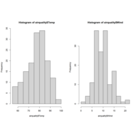
histgramPlot
par(mfrow = c(1,2))
hist(airquality$Temp)
hist(airquality$Wind)
par(mfrow = c(1,1))
boxplot(airquality$Temp)
par(mfcol = c(1,1))
hist(airquality$Temp)
hist(airquality$Wind)
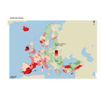
choroLayerPlot
plot(nuts0.spdf, border = NA, col = NA, bg = "#A6CAE0")
plot(world.spdf, col = "#E3DEBF", border = NA, add = TRUE)
# Add annual growth
choroLayer(spdf = nuts2.spdf, df = nuts2.df, var = "cagr",
breaks = c(-2.43, -1, 0, 0.5, 1, 2, 3.1), col = cols,
border = "grey40", lwd = 0.5, legend.pos = "right",
legend.title.txt = "taux de croissance\nannuel moyen",
legend.values.rnd = 2, add = TRUE)
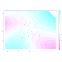
levelPlot
data <- data.frame(x = rnorm(100), y = rnorm(100))
data$z <- with(data, x * y + rnorm(100, sd = 1))
levelplot(z ~ x * y, data,
panel = panel.levelplot.points, cex = 1.2
) +
layer_(panel.2dsmoother(..., n = 200))
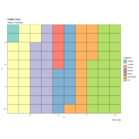
wafflePlot
ggplot(df, aes(x = x, y = y, fill = category)) +
geom_tile(color = "black", size = 0.5) +
scale_x_continuous(expand = c(0, 0)) +
scale_y_continuous(expand = c(0, 0), trans = 'reverse') +
scale_fill_brewer(palette = "Set3") +
labs(title="Waffle Chart", subtitle="'Class' of vehicles",
caption="Source: mpg")
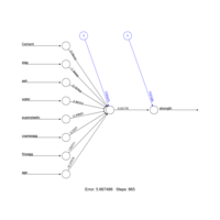
criticalPath
normalize <- function(x){ return ((x-min(x))/(max(x)-min(x)))}
concrete_norm <- as.data.frame(lapply(concrete,normalize))
concrete_train <- concrete_norm[1:773,]
concrete_test <- concrete_norm[774:1030,]
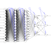
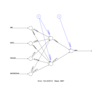
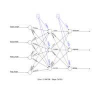
train75test25Plot
cor(predicted_strength,concrete_test$strength)
concrete_model2 <- neuralnet(strength ~ Cemen+fineagg+age..,
data=concrete_train,hidden=5)
plot(concrete_model2)
scaledownPlot
scl <- function(x){ (x - min(x))/(max(x) - min(x)) }
train[, 1:13] <- data.frame(lapply(train[, 1:13], scl))
f <- as.formula(paste("l1 + l2 + l3 ~", paste(n[!n %in%
c("l1","l2","l3")], collapse = " + ")))
nn <- neuralnet(f,data = train,
hidden = c(10, 10, 1),
act.fct = "logistic",
linear.output = FALSE,
lifesign = "minimal")
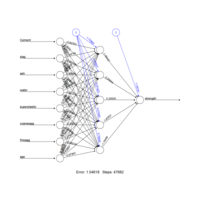
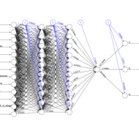
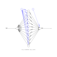
fpcfanntPlot
# Scale data
scl <- function(x){ (x - min(x))/(max(x) - min(x)) }
train[, 1:13] <- data.frame(lapply(train[, 1:13], scl))
head(train)
# Set up formula
n <- names(train)
f <- as.formula(paste("l1 + l2 + l3 ~", paste(n[!n %in% c("l1","l2","l3")], collapse = " + ")))
f
nn <- neuralnet(f,
data = train,
hidden = c(13, 10, 3),
act.fct = "logistic",
linear.output = FALSE,
lifesign = "minimal")
plot(nn)
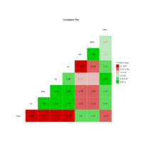
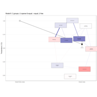
ggcorSemPlot
semPaths(fit,"std",layout = 'tree', edge.label.cex=.9, curvePivot = TRUE)
ggcorr(mtcars[-c(5, 7, 8)], nbreaks = 6, label = T, low = "red3", high = "green3",
label_round = 2, name = "Correlation Scale", label_alpha = T, hjust = 0.75) +
ggtitle(label = "Correlation Plot") +
theme(plot.title = element_text(hjust = 0.6))
weightSemPath
fit <- cfa(model, data = mtcars)
summary(fit, fit.measures = TRUE, standardized=T,rsquare=T)
semPaths(fit, 'std', layout = 'circle')
semPaths(fit,"std",layout = 'tree', edge.label.cex=.9, curvePivot = TRUE)
cfaPlot
model <-'
mpg ~ hp + gear + cyl + disp + carb + am + wt
hp ~ cyl + disp + carb
'
fit <- cfa(model, data = mtcars)
summary(fit, fit.measures = TRUE, standardized=T,rsquare=T)
semPaths(fit, 'std', layout = 'circle')
peripheralPathAnalys
lavaan_m2 <- '
cmedv ~ log_crim + nox #crime and nox predict lower home prices
nox ~ rad #proximity to highways predicts nox
'
mlav2 <- sem(lavaan_m2, data=BostonSmall)
semPaths(mlav2, what='std', nCharNodes=6, sizeMan=10,
edge.label.cex=1.25, curvePivot = TRUE, fade=FALSE)
peripheralPathAnalysis
lavaan_m2 <- '
cmedv ~ log_crim + nox #crime and nox predict lower home prices
nox ~ rad #proximity to highways predicts nox
'
mlav2 <- sem(lavaan_m2, data=BostonSmall)
semPaths(mlav2, what='std', nCharNodes=6, sizeMan=10,
edge.label.cex=1.25, curvePivot = TRUE, fade=FALSE)
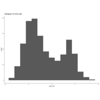
histggPlot
ggplot(BostonSmall, aes(x=log_crim)) + geom_histogram(bins=15) +
theme_classic() + ggtitle("Histogram of crime rate")
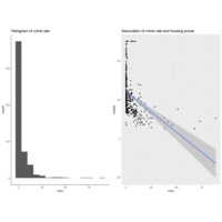
grid_cowPlot
g1 <- ggplot(BostonSmall, aes(x=crim)) + geom_histogram(bins=15)
g2 <- ggplot(BostonSmall, aes(x=crim, y=cmedv)) + geom_point() +
stat_smooth(method="lm") + ggtitle("Association..prices")
plot_grid(g1, g2, nrow=1)
sem2Plot
model2<-' int~att+sn+a*pbc beh~b*int+c*pbc
indirect := a*b #the := indicates a defined var
direct := c total := c + a*b'
results2<-sem(model2,sample.cov=dat,sample.nobs=131)
summary(results2,standardized=T,fit=T,rsquare=T)
sem1Plot
dat
model<-'
int~att+sn+pbc
beh~int+pbc
'results<-sem(model,sample.cov=dat,sample.nobs=131)
summary(results,standardized=T,fit=T,rsquare=T)
singlemPathPlot
model2 = 'mpg ~ hp + gear + cyl + disp + carb + am + wt
hp ~ cyl + disp + carb'
fit2 = cfa(model2, data = data2)
semPaths(fit2, 'std', 'est', curveAdjacent = TRUE, style = "lisrel")
singlePathPlot
model1 = 'Z ~ x1 + x2 + x3 + Y
Y ~ x1 + x2'
fit1 = cfa(model1, data = data1)
summary(fit1, fit.measures = TRUE, standardized = TRUE, rsquare = TRUE)
semPaths(fit1, 'std', layout = 'circle')
corforPathPlot
x1 = rnorm(20, mean = 0, sd = 1)
x2 = rnorm(20, mean = 0, sd = 1)
x3 = runif(20, min = 2, max = 5)
Y = a*x1 + b*x2
Z = c*x3 + d*Y
data1 = cbind(x1, x2, x3, Y, Z)
head(data1, n = 10)
cor1 = cor(data1)
corrplot(cor1, method = 'square')
pathAnalysisPlot
render.d3movie(short.stergm.sim,
displaylabels=TRUE)
vs <- data.frame(onset=0, terminus=50, vertex.id=1:17)
es <- data.frame(onset=1:49, terminus=50,
head=as.matrix(net3, matrix.type="edgelist")[,1],
tail=as.matrix(net3, matrix.type="edgelist")[,2])
stergmSimPlot
plot(short.stergm.sim)
plot( network.extract(short.stergm.sim, at=1) )
vs <- data.frame(onset=0, terminus=50, vertex.id=1:17)
es <- data.frame(onset=1:49, terminus=50,
head=as.matrix(net3, matrix.type="edgelist")[,1],
tail=as.matrix(net3, matrix.type="edgelist")[,2])
filmsTripPlot
filmstrip(net3.dyn, displaylabels=F, mfrow=c(1, 5),
slice.par=list(start=0, end=49, interval=10,
aggregate.dur=10, rule='any'))
dynPlot
net3.dyn <- networkDynamic(base.net=net3, edge.spells=es, vertex.spells=vs)
plot(net3.dyn, vertex.cex=(net3 %v% "audience.size")/7, vertex.col="col")
stermPlot
plot( network.extract(short.stergm.sim, onset=1, terminus=5, rule="all") )
plot( network.extract(short.stergm.sim, onset=1, terminus=10, rule="any") )
render.d3movie(short.stergm.sim,displaylabels=TRUE)
stermsigPlot
render.d3movie(net3,
launchBrowser=F, filename="Media-Network.html" )
data(short.stergm.sim)
short.stergm.sim
head(as.data.frame(short.stergm.sim))

arcEdgesPlot
for(i in 1:nrow(flights)) {
arc <- gcIntermediate( c(node1[1,]$longitude, node1[1,]$latitude),
c(node2[1,]$longitude, node2[1,]$latitude),
n=1000, addStartEnd=TRUE )
}
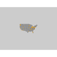
addNodesPlot
# Plot a map of the united states:
map("state", col="grey60", fill=TRUE, bg="gray80", lwd=0.1)
# Add a point on the map for each airport:
points(x=airports$longitude, y=airports$latitude, pch=19,
cex=airports$Visits/80, col="orange")
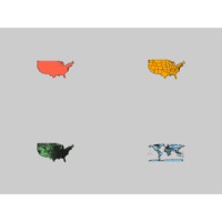
mapDataPlot
map("usa", col="tomato", border="gray10", fill=TRUE, bg="gray80")
map("state", col="orange", border="gray10", fill=TRUE, bg="gray80")
map("county", col="palegreen", border="gray10", fill=TRUE, bg="gray80")
map("world", col="skyblue", border="gray10", fill=TRUE, bg="gray80")
linksD3HTML
forceNetwork(Links = links.d3, Nodes = nodes.d3, Source="from", Target="to",
NodeID = "idn", Group = "type.label",linkWidth = 1,
linkColour = "#afafaf", fontSize=12, zoom=T, legend=T,
Nodesize=6, opacity = 0.8, charge=-300,
width = 600, height = 400)
nodesGroupHTML
nodes$group <- nodes$type.label
visnet3 <- visNetwork(nodes, links)
visnet3 <- visGroups(visnet3, groupname = "Newspaper", shape = "square",
color = list(background = "gray", border="black"))
visLegend(visnet3, main="Legend", position="right", ncol=1)
sbyTypeHTML
visOptions(visnet, highlightNearest = TRUE, selectedBy = "type.label")

visnet2HTML
visnet2 <- visNetwork(nodes, links)
visnet2 <- visNodes(visnet2, shape = "square", shadow = TRUE,
color=list(background="gray", highlight="orange", border="black"))
visnet2 <- visEdges(visnet2, color=list(color="black", highlight = "orange"),
smooth = FALSE, width=2, dashes= TRUE, arrows = 'middle' )
visnet2
vizNetHTML
vis.links$width <- 1+links$weight/8 # line width
vis.links$color <- "gray" # line color
vis.links$arrows <- "middle" # arrows: 'from', 'to', or 'middle'
vis.links$smooth <- FALSE # should the edges be curved?
vis.links$shadow <- FALSE # edge shadow
visnet <- visNetwork(vis.nodes, vis.links)
visnet
visNetworkHTML
# adding new node and edge attributes to our dataframes.
vis.nodes <- nodes
vis.links <- links
vis.nodes$shape <- "dot"
vis.nodes$shadow <- TRUE # Nodes will drop shadow
vis.nodes$color.background <- c("slategrey", "tomato", "gold")
[nodes$media.type]
visNetwork(vis.nodes, vis.links)
hyperlinksHTML
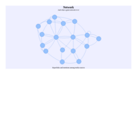
visNetwork(nodes, links, width="100%", height="400px", background="#eeefff",
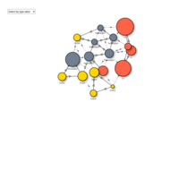
main="Network", submain="And what a great network it is!",
footer= "Hyperlinks and mentions among media sources")
animationNtHTML
visNetwork(nodes, links, width="100%", height="400px", background="#eeefff",
main="Network", submain="And what a great network it is!",
footer= "Hyperlinks and mentions among media sources")
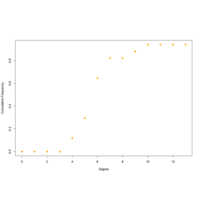
cumFrequncyPlot
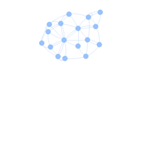
deg.dist <- degree_distribution(net, cumulative=T, mode="all")
plot( x=0:max(degree(net)), y=1-deg.dist, pch=19, cex=1.2, col="orange",
xlab="Degree", ylab="Cumulative Frequency")
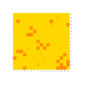
heatmapNPlot
netm <- get.adjacency(net, attr="weight", sparse=F)
colnames(netm) <- V(net)$media
rownames(netm) <- V(net)$media
palf <- colorRampPalette(c("gold", "dark orange"))
heatmap(netm[,17:1], Rowv = NA, Colv = NA, col = palf(100),
scale="none", margins=c(10,10) )
sizeNodePlot
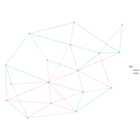
ggraph(net, layout="lgl") +
geom_edge_link(aes(color = type)) + # colors by edge type
geom_node_point(aes(size = audience.size)) + # size by audience size
theme_void()
arcNodesPlot
ggraph(net, layout = 'linear') +
geom_edge_arc(color = "orange", width=0.7) +
geom_node_point(size=5, color="gray80") +
theme_void()
pathNonodePlot
ggraph(net, layout="lgl") +
geom_edge_link() +
ggtitle("Look ma, no nodes!") # add title to the plot

ggraphPathPlot
ggraph(net) +
geom_edge_link() + # add edges to the plot
geom_node_point() # add nodes to the plot
statentPlot
plot(net3, vertex.cex=(net3 %v% "audience.size")/7, vertex.col="col", interactive=T)
multiplexntPlot
l <- layout_with_fr(net)
plot(net.h, vertex.color="orange", layout=l, main="Tie: Hyperlink")
plot(net.m, vertex.color="lightsteelblue2", layout=l, main="Tie: Mention")
multiplexNetPlot
par(mfrow=c(1,2))
plot(net.h, vertex.color="orange", layout=layout_with_fr, main="Tie: Hyperlink")
plot(net.m, vertex.color="lightsteelblue2", layout=layout_with_fr, main="Tie: Mention")
circleEdgePlot
E(net)$width <- 1.5
plot(net, edge.color=c("dark red", "slategrey")[(E(net)$type=="hyperlink")+1],
vertex.color="gray40", layout=layout_in_circle, edge.curved=.3)
gcharNodesPlot
net2.bp <- bipartite.projection(net2)
plot(net2.bp$proj1, vertex.label.color="black", vertex.label.dist=1,
vertex.label=nodes2$media
[!is.na(nodes2$media.type)])
imageNodesPlot
img.1 <- readPNG("./images/news.png")
img.2 <- readPNG("./images/user.png")
V(net2)$raster <- list(img.1, img.2)[V(net2)$type+1]
plot(net2, vertex.shape="raster", vertex.label=NA,
vertex.size=16, vertex.size2=16, edge.width=2)
charNodesPlot
plot(net2, vertex.shape="none", vertex.label=nodes2$media,
vertex.label.color=V(net2)$color, vertex.label.font=2,
vertex.label.cex=.6, edge.color="gray70", edge.width=2)

fillNodePlot
# Media outlets are blue squares, audience nodes are orange circles:
V(net2)$color <- c("steel blue", "orange")[V(net2)$type+1]
V(net2)$shape <- c("square", "circle")[V(net2)$type+1]
plot(net2, vertex.label.color="white", vertex.size=(2-V(net2)$type)*8)
node2Plot
tkid <- tkplot(net) #tkid is the id of the tkplot that will open
l <- tkplot.getcoords(tkid) # grab the coordinates from tkplot
plot(net, layout=l)
head(nodes2)
head(links2)
net2
plot(net2, vertex.label=NA)
groupClustersPlot
par(mfrow=c(1,2))
plot(net, mark.groups=c(1,4,5,8), mark.col="#C5E5E7", mark.border=NA)
# Mark multiple groups:
plot(net, mark.groups=list(c(1,4,5,8), c(15:17)),
mark.col=c("#C5E5E7","#ECD89A"), mark.border=NA)
clusterNetPlot
clp <- cluster_optimal(net)
class(clp)
V(net)$community <- clp$membership
colrs <- adjustcolor( c("gray50", "tomato", "gold", "yellowgreen"), alpha=.6)
plot(net, vertex.color=colrs[V(net)$community])
mfrowLayout1Plot
par(mfrow=c(3,3), mar=c(1,1,1,1))
for (layout in layouts) {
print(layout)
l <- do.call(layout, list(net))
plot(net, edge.arrow.mode=0, layout=l, main=layout) }
weightedEdgeNodePlot
V(net)$label <- NA
# Set edge width based on weight:
E(net)$width <- E(net)$weight/6
#change arrow size and edge color:
E(net)$arrow.size <- .2
E(net)$edge.color <- "gray80"
graph_attr(net, "layout") <- layout_with_lgl
plot(net)
vertexConentPlot
plot(net, edge.arrow.size=.2, edge.color="orange",
vertex.color="orange", vertex.frame.color="#ffffff",
vertex.label=V(net)$media, vertex.label.color="black")
curvedEdgePlot
# Plot with curved edges (edge.curved=.1) and reduce arrow size:
# Note that using curved edges will allow you to see multiple links
# between two nodes (e.g. links going in either direction, or multiplex links)
plot(net, edge.arrow.size=.4, edge.curved=.1)
plot(net, edge.arrow.size=.4, edge.curved=.1)
simplifyNodePlot
E(net) # The edges of the "net" object
V(net) # The vertices of the "net" object
E(net)$type # Edge attribute "type"
V(net)$media # Vertex attribute "media"
edgesVerticesPlot
# Get an edge list or a matrix:
as_edgelist(net, names=T)
as_adjacency_matrix(net, attr="weight")
# Or data frames describing nodes and edges:
as_data_frame(net, what="edges")
as_data_frame(net, what="vertices")
layoutmPlot
l <- layout_with_fr(net.bg, dim=3)
plot(net.bg, layout=l)
l <- layout_with_kk(net.bg)
plot(net.bg, layout=l)
l <- layout_with_graphopt(net.bg)
plot(net.bg, layout=l)

layoutkkPlot
l1 <- layout_with_graphopt(net.bg, charge=0.02)
l2 <- layout_with_graphopt(net.bg, charge=0.00000001)
par(mfrow=c(1,2), mar=c(1,1,1,1))
plot(net.bg, layout=l1)
plot(net.bg, layout=l2)
layouthirachePlot
l <- layout_with_fr(net.bg)
l <- norm_coords(l, ymin=-1, ymax=1, xmin=-1, xmax=1)
par(mfrow=c(2,2), mar=c(0,0,0,0))
plot(net.bg, rescale=F, layout=l*0.4)
plot(net.bg, rescale=F, layout=l*0.6)
plot(net.bg, rescale=F, layout=l*0.8)
plot(net.bg, rescale=F, layout=l*1.0)
layoutOnePlot
l <- layout_on_sphere(net.bg)
plot(net.bg, layout=l)
par(mfrow=c(2,2), mar=c(0,0,0,0)) # plot four figures - 2 rows, 2 columns
plot(net.bg, layout=layout_with_fr)
plot(net.bg, layout=layout_with_fr)
plot(net.bg, layout=l)
plot(net.bg, layout=l)
netSpherePlot
l <- layout_randomly(net.bg)
plot(net.bg, layout=l)
# 3D sphere layout
l <- layout_on_sphere(net.bg)
plot(net.bg, layout=l)
netRandomPlot
E(net.bg)$arrow.mode <- 0
plot(net.bg)
plot(net.bg, layout=layout_randomly)
l <- layout_randomly(net.bg)
plot(net.bg, layout=l)
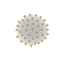
factornetPlot
net.bg <- sample_pa(100)
V(net.bg)$size <- 8
V(net.bg)$frame.color <- "white"
V(net.bg)$color <- "orange"
V(net.bg)$label <- ""
E(net.bg)$arrow.mode <- 0
plot(net.bg)
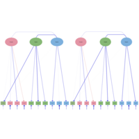
neuralnetSPlot
nn <- neuralnet(
case~age+parity+induced+spontaneous,
data=infert, hidden=2, err.fct="ce",
linear.output=FALSE)
out <- cbind(nn$covariate,nn$net.result[[1]])
dimnames(out) <- list(NULL, c("age", "parity","induced","spontaneous","nn-output"))
qgraphPlot
cols[st<0] <- qgraph:::Fade(cols[st<0],alpha = abs(st)[st<0], "white")
qgraph(network, layout = "spring", labels = labels,
shape = "rectangle", vsize = 15, vsize2 = 8,
theme = "colorblind", color = cols,
cut = 0.5, repulsion = 0.9)
factorsNetworkPlot
qgraph(network, layout = "spring", labels = labels,
shape = "rectangle", vsize = 15, vsize2 = 8,
theme = "colorblind", color = cols,
cut = 0.5, repulsion = 0.9)
latentNodePlot
mod_lisl <- lislModel(LY = getmatrix(lnmmod, "lambda"),
PS = getmatrix(lnmmod, "sigma_zeta"),
TE = getmatrix(lnmmod, "sigma_epsilon"),
latNamesEndo = latents,
manNamesEndo = obsvars)
factorLoadingPlot
qgraph(net2, layout = Layout, theme = "colb", title = "ggmM",
labels = obsvars)
# Factor loadings matrix:
Lambda <- matrix(0, 10, 3)
Lambda[1:4,1] <- 1
lavvanPlot
model.Lavaan <- 'f1 =~ y1 + y2 + y3
f2 =~ y4 + y5 + y6
f1 + f2 ~ x1 + x2 + x3 '
library("lavaan")
fit <- lavaan:::cfa(model.Lavaan, data=Data, std.lv=TRUE)
latentVarPlot
model <- mxRun(model) #run model, returning the result
semPaths(model, color = list(
lat = rgb(245, 253, 118, maxColorValue = 255),
man = rgb(155, 253, 175, maxColorValue = 255)),
mar = c(10, 5, 10, 5))
atomicTestPlot
qgraph(E, edge.color = eCol, asize = 8, labels = labels,
label.scale.equal = FALSE, bidirectional = TRUE,
mar = c(6,5,5,5), esize = 4, label.cex = 1,
edge.labels = eLabs, edge.label.cex = 2,
bg = "transparent", edge.label.bg = "white",
loopRotation = loopRot)
simulationDataPlot
data(bfi)
bfiSub <- bfi[,1:25]
# Correlations:
corMat <- cor(bfiSub, use = "pairwise.complete.obs")
N <- nrow(bfiSub)
fa.parallel(corMat, N, fa = "fa")
semPathPlot
cfa3_2 <- '
dem65 =~ NA*y5 + y6 + y7 + y8
dem65 ~~ 1*dem65
'fit2 <- cfa(cfa3_2, data = PoliticalDemocracy)
summary(fit2, fit.measures = TRUE, standardized=TRUE)
candlesLinePlot
names(formals(plot.xts))
data("sample_matrix")
sample_xts<-as.xts(sample_matrix)
plot(sample_xts[,1])
class(sample_xts[,1])
plot(sample_xts[1:30,],type="candles")
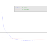
runfuncaToolsPlot
n=200;k=25
set.seed(100)
x=rnorm(n,sd=30)+abs(seq(n)-n/4)
plot(x,main="AnalysisFunctions")
lines(runmin(x,k),col="coral")
lines(runmax(x,k),col="cyan")
...
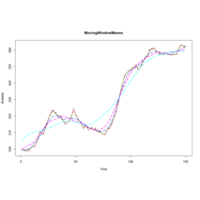
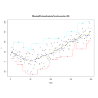
runmeancaToolsPlot
plot(BJsales, col="black", lty=1, lwd=1, main="MovingWindowMeans")..
lines(runmean(BJsales, 24), col="magenta", lty=5, lwd=2)
lines(runmean(BJsales, 50), col="cyan", lty=6, lwd=2)
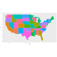
mapDataPlot
states<-map_data(map="state")
head(states)
p<-ggplot(data=states)+
geom_polygon(aes(x=long, y=lat,
fill=region, group=group),
color="white")+
guides(fill=FALSE)
p+coord_fixed(1.3)
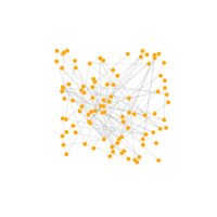
spinglassPlot
g<-tr<-make_tree(40, children =3, mode="undirected")#networkfirst
sping<-spinglass.community(g)
plot(sping,g)
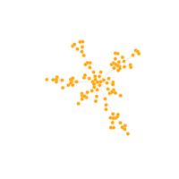
st<-make_star(60)
plot(st,vertex.size=10, vertex.label=NA)
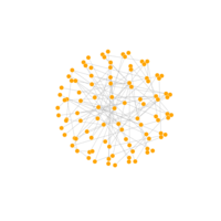
fullgraphPlot
eg<-make_full_graph(40)
plot(eg, vertex.size=10,vertex.label=NA)
fg<-make_full_graph(40)
plot(fg, vertex.size=10,vertex.label=NA)
igraphPlot
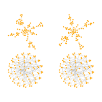
g<-tr<-make_tree(40, children =3, mode="undirected")#networkfirst
plot(g)
fg<-make_full_graph(40)
plot(fg, vertex.size=10,vertex.label=NA)
globalWeightPlot
par(mfrow=c(2,2))
gwplot(network,selected.covariate = "Petal.Width")
...
neuralnetTPlot
ind<-sample(2,nrow(iris),replace = T,prob = c(0.7,0.3))
trainset<-iris[ind==1,]
testset<-iris[ind==2,]
trainset$setosa<-trainset$Species=="setosa"..
network<-neuralnet(versicolor+virginica+setosa~Sepal...
trainset,hidden = 3)
network
neuralnetPlot
Var1 <- runif(100, min=0,max=100)
sqrt.data <- data.frame(Var1, Sqrt=sqrt(Var1))
net.sqrt <- neuralnet(Sqrt~Var1, sqrt.data, hidden=10, threshold=0.01)
print(net.sqrt)
plot(net.sqrt)
torturedCirclePlot
#theta tortured circle bar
ggplot(mpg, aes(class))+geom_bar(aes(fill=drv))+
coord_polar(theta = "y")
ggplot(mpg, aes(class))+geom_bar(aes(fill=drv))+
coord_polar(theta = "x")
polymorphismBarPlot
ggplot(mpg, aes(class))+geom_bar(aes(fill=drv))+
coord_polar(theta = "y")
ggplot(mpg, aes(class))+geom_bar(aes(fill=drv))+
coord_polar(theta = "x")
t_testPlot
curve(dt(x, 1), -6, 6, ylab = "p(x)", lwd = 2, ylim = c(0, 0.4))
curve(dt(x, 2), -6, 6, col = 2, add = T, lwd = 2)
curve(dt(x, 5), -6, 6, col = 3, add = T, lwd = 2)
curve(dt(x, 10), -6, 6, col = 4, add = T, lwd = 2)
curve(dnorm(x), col = 6, add = T, lwd = 2, lty = 2)
legend("topright", legend = c("df=1", "df=2", "df=5", "df=10", "df=Inf"))
FtestPlot
curve(df(x, 4, 1), 0, 4, ylab = "p(x)", lwd = 2, ylim = c(0, 0.8))
curve(df(x, 4, 4), 0, 4, col = 2, add = T, lwd = 2)
curve(df(x, 4, 10), 0, 4, col = 3, add = T, lwd = 2)
curve(df(x, 4, 4000), 0, 4, col = 4, add = T, lwd = 2)
legend("topright", legend = c("F(4,1)", "F(4,4)", "F(4,10)", "F(4,4000)"), col = 1:4, lwd = 2)
qf(0.95,10,5)
qf(0.05,5,10)
1/qf(0.05,5,10)
dchisqPlot
##chi-squared distribution with df=4,6 and 10 ===
curve(dchisq(x, 4), 0, 20, col = 3, lty = 3, lwd = 2, ylab = "p(x)")
curve(dchisq(x, 6), 0, 20, col = 4, add = T, lty = 4, lwd = 2)
curve(dchisq(x, 10), 0, 20, col = 5, add = T, lty = 5, lwd = 2)
legend("topright", legend = c("df=4", "df=6", "df=10"), col = 3:5, lty = 3:5, lwd = 2)
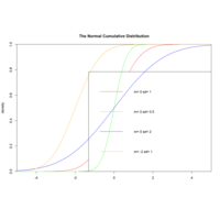
pnormPlot
plot(x,y,col="red",xlim=c(-5,5),ylim=c(0,1),type="l",
xaxs="i",yaxs="i",ylab='density',xlab='',
main="The Normal Cumulative Distribution")
lines(x,pnorm(x,0,0.5),col="green")
lines(x,pnorm(x,0,2),col="blue")
lines(x,pnorm(x,-2,1),col="orange")
legend("bottomright",legend=paste("m=",c(0,0,0,-2),"sd=")
chisquareDPlot
chif <- function(x, df) {
dchisq(x, df = df)
}
## === chi-squared distribution with df=1,2, 4, 6 and 10 ===
curve(chif(x, df = 1), 0, 20, ylab = "p(x)", lwd = 2)
curve(chif(x, df = 2), 0, 20, col = 2, add = T, lty = 2, lwd = 2)
curve(chif(x, df = 4), 0, 20, col = 3, add = T, lty = 3, lwd = 2)
curve(chif(x, df = 6), 0, 20, col = 4, add = T, lty = 4, lwd = 2)
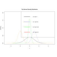
dnormCurlPlot
plot(x,dnorm(x),type="l",xlim=c(-5,5),ylim=c(0,2),
main="The Normal Density Distribution")
curve(dnorm(x,1,0.5),add=T,lty=2,col="blue")
lines(x,dnorm(x,0,0.25),col="green")
lines(x,dnorm(x,-2,0.5),col="orange")
legend("topright",legend=paste("m=",c(0,1,0,-2),"sd=",
c(1,0.5,0.25,0.5)),lwd=3,
lty=c(1,2,1,1),col=c("black","blue","green","red"))
confidIntervalPlot
pvals <- seq(p.hat-5*p.se, p.hat+5*p.se,length=100)
p.samp <- dnorm(pvals, mean=p.hat, sd=p.se)
plot(pvals, p.samp, type="l", xlab = "", ylab = "",
xlim = p.hat+c(-4,4)*p.se, ylim = c(0, max(p.samp)))
abline(h=0, col="coral")
pvals.sub <- pvals[pvals>0.7 & pvals<=0.75]
p.samp.sub <- p.samp[pvals>=0.7 & pvals<=0.75]
polygon(cbind(c(0.7,pvals.sub,0.75), c(0,p.samp.sub,0)),
border=NA, col = "coral")
dnormPlot
xvals <- seq(-5,5, length=100)
fx.samp.t <- dt(xvals, df=4)
plot(xvals, dnorm(xvals), type="l", lty=2, lwd=2, col="coral", xlim = c(-4,4), xlab="", ylab = "")
abline(h=0, col="gray")
lines(xvals, fx.samp.t, lty=3, lwd=2)
polygon(cbind(c(t4,-5,xvals[xvals<=4]), c(0,0, fx.samp.t[xvals<=4])),
density=10, lty = 3)
distrbnPlot
abline(v=21.5, col="gray")
xvals.sub <- xvals[xvals<=21.5]
fx.sub <- fx[xvals<=21.5]
fx.samp.sub <- fx.samp[xvals<=21.5]
polygon(cbind(c(21.5,xvals.sub), c(0,fx.sub)), density=10)
polygon(cbind(c(21.5,xvals.sub), c(0,fx.samp.sub)), density=10, angle=120,lty=2)

rayrenderPlot
render_highquality(samples = 400, aperture=30, light = FALSE, ambient = TRUE,focal_distance = 1700,
obj_material = rayrender::dielectric(attenuation = c(1,1,0.3)/200),
ground_material = rayrender::diffuse(checkercolor = "grey80",sigma=90,checkerperiod = 100))
multicorePlot
plot_gg(pp, width = 5, height = 4, scale = 300, raytrace = FALSE, preview = TRUE)
plot_gg(pp, width = 5, height = 4, scale = 300, multicore = TRUE, windowsize = c(1000, 800))
render_camera(fov = 70, zoom = 0.5, theta = 130, phi = 35)
Sys.sleep(0.2)
render_snapshot(clear = TRUE)
rayimageTerrainmeshrPlot
mtplot = ggplot(mtcars) +
scale_color_continuous(limits = c(0, 8))
par(mfrow = c(1, 2))
plot_gg(mtplot, width = 3.5, raytrace = FALSE, preview = TRUE)
plot_gg(mtplot, width = 3.5, multicore = TRUE, windowsize = c(800, 800),
zoom = 0.85, phi = 35, theta = 30, sunangle = 225, soliddepth = -100)
terrainmeshrRayimagePlot
ggvolcano = volcano %>%
melt() %>%
ggplot() +
geom_tile(aes(x = Var1, y = Var2, fill = value)) +
geom_contour(aes(x = Var1, y = Var2, z = value), color = "black") +
scale_x_continuous("X", expand = c(0, 0)) +
scale_y_continuous("Y", expand = c(0, 0)) +
scale_fill_gradientn("Z", colours = terrain.colors(10)) +
coord_fixed()
par(mfrow = c(1, 2))
plot_gg(ggvolcano, width = 7, height = 4, raytrace = FALSE, preview = TRUE)
rayshaderggPlot
#3D plotting with rayshader and ggplot2
library(ggplot2)
ggdiamonds = ggplot(diamonds) +
stat_density_2d(aes(x = x, y = depth, fill = stat(nlevel)),
geom = "polygon", n = 100, bins = 10, contour = TRUE) +
facet_wrap(clarity~.) +
scale_fill_viridis_c(option = "A")
Sys.sleep(0.2)
render_snapshot(clear = TRUE)
rayshaderPlot
plot_gg(ggdiamonds, width = 5, height = 5, raytrace = FALSE, preview = TRUE)
plot_gg(ggdiamonds, width = 5, height = 5, multicore = TRUE, scale = 250,
zoom = 0.7, theta = 10, phi = 30, windowsize = c(800, 800))
Sys.sleep(0.2)
render_snapshot(clear = TRUE)
plotggPlot
gg = ggplot(diamonds, aes(x, depth)) +
stat_density_2d(aes(fill = stat(nlevel)),
geom = "polygon",
n = 100,bins = 10, contour = TRUE) +
facet_wrap(clarity~.) +
scale_fill_viridis_c(option = "A")
plot_gg(gg,multicore=TRUE,width=5,
height=5,scale=250)
surf3DPlot
par(mar = c(2, 2, 2, 2))
par(mfrow = c(1, 1))
R <- 3 r <- 2
x <- seq(0, 2*pi,length.out=50)
y <- seq(0, pi,length.out=50)
M <- mesh(x, y)
alpha <- M$x beta <- M$y
surf3D(x = (R + r*cos(alpha)) * cos(beta),
y = (R + r*cos(alpha)) * sin(beta),
z = r * sin(alpha),
colkey=FALSE,
bty="b2",
main="Half of a Torus")
image3DPlot
Vx <- volcano[-1, ] - volcano[-nrow(volcano), ]
image3D(z = -60, colvar = Vx/10, add = TRUE,
colkey = list(length = 0.2, width = 0.4, shift = -0.15,
cex.axis = 0.8, cex.clab = 0.85),
clab = c("","gradient","m/m"), plot = FALSE)
contour3D(z = -60+0.01, colvar = Vx/10, add = TRUE,
col = "black", plot = TRUE)
image2DPlot
image2D(z = Oxsat$val, subset = sub,
x = Oxsat$lon, y = Oxsat$lat,
margin = c(1, 2), NAcol = "cyan", colkey = FALSE,
xlab = "longitude", ylab = "latitude",
main = paste("depth ", Oxsat$depth[sub], " m"),
clim = c(0, 115), mfrow = c(2, 2))
colkey(clim = c(0, 115), clab = c("O2 saturation", "percent"))
arrow3DPlot
arrows2D(x0 = runif(10), y0 = runif(10),
x1 = runif(10), y1 = runif(10), colvar = 1:10,
code = 3, main = "arrows2D")
arrows3D(x0 = runif(10), y0 = runif(10), z0 = runif(10),
x1 = runif(10), y1 = runif(10), z1 = runif(10),
colvar = 1:10, code = 1:3, main = "arrows3D",
colkey = FALSE)
scatter3DPlot
zmin <- min(-quakes$depth)
XY <- trans3D(quakes$long, quakes$lat,
z = rep(zmin, nrow(quakes)), pmat = pmat)
scatter2D(XY$x, XY$y, colvar = quakes$mag, pch = ".",
cex = 2, add = TRUE, colkey = FALSE)
xmin <- min(quakes$long)
XY <- trans3D(x = rep(xmin, nrow(quakes)), y = quakes$lat,
z = -quakes$depth, pmat = pmat)
scatter2D(XY$x, XY$y, colvar = quakes$mag, pch = ".",
cex = 2, add = TRUE, colkey = FALSE)
surf3DPlot
M <- mesh(seq(-13.2, 13.2, length.out = 50),
seq(-37.4, 37.4, length.out = 50))
u <- M$x ; v <- M$yb <- 0.4; r <- 1 - b^2; w <- sqrt(r)
D <- b*((w*cosh(b*u))^2 + (b*sin(w*v))^2)
x <- -u + (2*r*cosh(b*u)*sinh(b*u)) / D
y <- (2*w*cosh(b*u)*(-(w*cos(v)*cos(w*v)) -
sin(v)*sin(w*v))) / D
z <- (2*w*cosh(b*u)*(-(w*sin(v)*cos(w*v)) +
cos(v)*sin(w*v))) / D
surf3D(x, y, z, colvar = sqrt(x + 8.3), colkey = FALSE,
border = "black", box = FALSE)
persp3DPlot
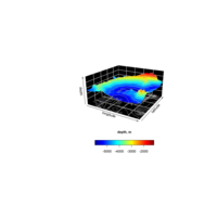
persp3D(z = Hypsometry$z[ii,jj], xlab = "longitude", bty = "bl2",
ylab = "latitude", zlab = "depth", clab = "depth, m",
expand = 0.5, d = 2, phi = 20, theta = 30, resfac = 2,
contour = list(col = "grey", side = c("zmin", "z")),
zlim = zlim, colkey = list(side = 1, length = 0.5))
rgl3DPlot
image3D(z = -60, colvar = Vx/10, add = TRUE,
colkey = list(length = 0.2, width = 0.4, shift = -0.15,
cex.axis = 0.8, cex.clab = 0.85),
clab = c("","gradient","m/m"), plot = FALSE)
contour3D(z = -60+0.01, colvar = Vx/10, add = TRUE,
col = "black", plot = TRUE)
pie3DPlot
#png(file = "3d_pie_chart.jpg")
# Plot the chart.
pie3D(x,labels = lbl,explode = 0.1,
main = "Pie Chart of Countries ")
# Save the file.
dev.off()
plotlyHTML
ggplot(df, aes(carat, price)) +
geom_point(color="plum",alpha=0.3) +
ggtitle("Diamonds") +
xlab("x-axis -> Carat") +
ylab("y-axis -> Price")
sdNormDHTML
norm1 <- data.frame(x=x, y=dnorm(x,mean = 0, sd=1))
norm2 <- data.frame(x=x, y=dnorm(x,mean = 0, sd=1.2))
norm3 <- data.frame(x=x, y=dnorm(x,mean = 0, sd=1.5))
norm4 <- data.frame(x=x, y=dnorm(x,mean = 0, sd=2))
CirclePlot
ggplot(data = ad, aes(fill = type, ymax = ymax,
ymin = ymin, xmax = 4, xmin = 3)) +
geom_rect(show.legend = F,alpha=0.9) +
scale_fill_brewer(palette = 'Set3')+
coord_polar(theta = "y") + labs(x = "", y = "",
title = "",fill='Rigion') + xlim(c(0, 5)) +
geom_text(aes(x = 2, y = ((ymin+ymax)/2),
label = type) ,size=2)
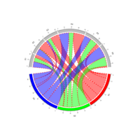
chordDPlot
mat <- matrix(rnorm(36), 6, 6)
rownames(mat) <- paste0("R", 1:6)
colnames(mat) <- paste0("C", 1:6)
mat[2, ] <- 1e-10
mat[, 3] <- 1e-10
chordDiagram(mat)
annotationTrackPlot
par(mfrow = c(1, 3))
chordDiagram(mat, grid.col = grid_col,
annotationTrack = "grid")
chordDiagram(mat, grid.col = grid_col,
annotationTrack = c("name", "grid"),
annotationTrackHeight = c(0.03, 0.01))
chordDiagram(mat, grid.col = grid_col,
annotationTrack = NULL)
arrowChordDPlot
arr_col <- data.frame(c("S1", "S2", "S3"), c("E5", "E6", "E4"),
c("black", "black", "black"))
chordDiagram(mat, grid.col = grid_col, directional = 1,
link.arr.col = arr_col, direction.type = "arrows",
link.arr.length = 0.2)
chordDiagram(mat, grid.col = grid_col, directional = 1,
direction.type = c("diffHeight", "arrows"),
link.arr.col = arr_col, link.arr.length = 0.2)
gridChordDPlot
mat2 <- matrix(sample(100, 35), nrow = 5)
rownames(mat2) <- letters[1:5]
colnames(mat2) <- letters[1:7]
mat2
chordDiagram(mat2, grid.col = 1:7,
directional = 1, row.col = 1:2)
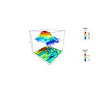
chordDGridPlot
par(mfrow = c(1, 3))
chordDiagram(mat, grid.col = grid_col, directional = 1)
chordDiagram(mat, grid.col = grid_col, directional = 1,
diffHeight = uh(5, "mm"))
chordDiagram(mat, grid.col = grid_col, directional = -1)
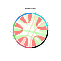
symmetricChrodDPlot
col_fun <- colorRamp2(c(-1, 0, 1), c("green", "white", "red"))
chordDiagram(cor_mat, grid.col = 1:5, symmetric = TRUE,
col = col_fun)
title("symmetric = TRUE")
chordDiagram(cor_mat, grid.col = 1:5,
col = col_fun)
chordDiagramPlot
chordDiagram(mat, grid.col = grid_col, link.border = "red")
lwd_mat <- matrix(1, nrow = nrow(mat), ncol = ncol(mat))
lwd_mat[mat > 12] <- 2
border_mat <- matrix(NA, nrow = nrow(mat), ncol = ncol(mat))
border_mat[mat > 12] <- "red"

CirclizePlot
Convert to polar coordinate system
Usage
circlize(
x, y,
sector.index = get.current.sector.index(),
track.index = get.current.track.index())
clustCombiPlot
data(Baudry_etal_2010_JCGS_examples)
output <- clustCombi(data = ex4.4.1)
output # is of class clustCombi
# plots the hierarchy of combined solutions, then some "entropy plots"
# may help one to select the number of classes
plot(output)
ggscatmatPlot
This function makes a scatterplot matrix for quantitative variables with density plots on the diagonal and correlation printed in the upper triangle.
ggscatmat(
data,
columns = 1:ncol(data),
color = NULL,
alpha = 1,
corMethod = "pearson"
)
scatterPlotMatrixPlot
interface to the pairs function to produce enhanced scatterplot matrices, including univariate displays on the diagonal and a variety of fitted lines, smoothers, variance functions, and concentration ellipsoids. spm is an abbreviation for scatterplotMatrix(~ income + education + prestige | type, data=Duncan)
coMapPlot
lat ~ long | depth, data = quakes, number = 4,
ylim = c(-45, -10.72), panel = function(x, y, ...) {
map("world2", regions = c("New Zealand","Fiji"),
add = TRUE, lwd = 0.1, fill = TRUE,col = "lightgray")
text(180, -13, "Fiji", adj = 1)
text(170, -35, "NZ")
points(x, y, col = rgb(0.2, 0.2, 0.2, 0.5))
}
ggpairGgallyPlot
ggpairs(
diamonds.samp[, c(1:2,5,7)],
mapping = aes(color = cut),
lower = list(continuous = wrap("density", alpha = 0.5), combo = "dot_no_facet"),
title = "Diamonds"
)
panelCorPlot
pairs(iris[1:4], main = "Anderson's Iris Data -- 3 species",
pch = 21, bg = c("red", "cyan", "blue")[unclass(iris$Species)],
diag.panel=panel.hist,
upper.panel=panel.cor,
lower.panel=panel.lm)
pairsCorPlot
pairs(~Sepal.Length+Sepal.Width+
Petal.Length+Petal.Width,
data=iris,main = "Anderson's IrisData3 species",
pch = 21, bg = c("red", "cyan", "blue")
[unclass(iris$Species)])
cpairsPlot
gclust: The Genie++ Hierarchical Clustering Algorithm
#cpairs{gclus}
library(gclus)
data(USJudgeRatings)
judge.cor <- cor(USJudgeRatings)
judge.color <- dmat.color(judge.cor)
cpairs(USJudgeRatings,
panel.colors=judge.color,
pch=".",gap=.5)
ggraphCirclePlot
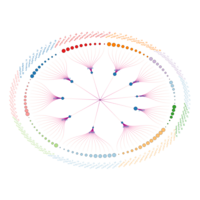
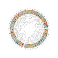
ggraph(mygraph, layout = 'dendrogram',circular = TRUE+geom_edge_diagonal(aes(colour=..index..)+scale_edge_colour_distiller(palette = "RdPu"+geom_node_text(aes(x=x*1.25, y=y*1.25, angle=angle, label=name, color=group), size=2.7, alpha=1+ geom_node_point(aes(x = x*1.07, y=y*1.07, fill=group, size=value), shape=21, stroke=0.2, color='black', alpha=1)
CircleFunctionPlot
for(i in 1:nr){circos.rect(1:nc -1, rep(nr - i, nc), 1:nc, rep(nr - i + 1, nc),
border = 'black', col = col_data[i, ], size=0.1)}
circos.text(CELL_META$xcenter, CELL_META$cell.ylim[1]+uy(25, "mm"),
CELL_META$sector.index)
circos.axis(labels.cex = 1, major.at = seq(0.5, round(CELL_META$xlim[2])+0.5,2),
labels=seq(0, round(CELL_META$xlim[2]),2))
})
viridisigraphPlot
mygraph <- graph_from_data_frame(edges, vertices=vertices)
ggraph(mygraph, layout = 'circlepack', weight= 2 )+geom_node_circle(aes(fill = depth))+geom_node_text(aes(label=shortName, filter=leaf, fill=depth, size=5))+ theme_void()+theme(legend.position="FALSE")+
scale_fill_viridis()
meltReshapePlot
ggplot(data=mydata,aes(x=id, y=value,group=variable,fill=variable)) +
geom_polygon(colour="black",alpha=0.1)+
geom_point(size=4,shape=21,color = 'black')+
#coord_radar()+coord_polar() +scale_x_continuous(breaks=label_data$id, labels=label_data$car)+ theme_bw() +ylim(0,22)+theme
coordPloarPlot
ggplot(mydata, aes(x = id, y = value)) + geom_polygon(color = "black", fill = brewer.pal(7, "Set1")[3], alpha = 0.1) + geom_point(size = 5, shape = 21, color = "black", fill = brewer.pal(7, "Set1")[1]) +coord_polar()
singlePolarPlot
theme(
panel.background = element_blank(),
panel.grid.major = element_line(colour = "grey80", size=.25),
axis.text.y = element_text(size = 12, colour = "black"),
axis.line.y = element_line(size = 0.25),
axis.text.x = element_text(size = 13, colour = "black", angle = myAngle))
coordpolarPlot
ggplot(data=df, aes(item, value, fill=score)) +geom_bar(stat="identity", color="plum",
position = position_dodge(),width = 0.7, size=0.25)+coord_polar(theta = "x", start=0)+ylim(c(-3,6)) + scale_fill_brewer(palette = "Reds") + theme_light()+theme(axis.title = element_text(size =13,color = "plum", angle = myAng))
nantingaleRoseChartPlot
myAngle <- seq(-20, -340, length.out = 8)
ggplot(diamonds, aes(x=clarity, fill=color)) + geom_bar(width = 1.0, colour = "black", size = 0.25) + coord_polar(theta = "x", start = 0) + # scale_fill_brewer(palette = "Reds") + guides(fill = guide_legend(reverse = TRUE, title = "Color")) + ylim(c(-2000,12000)) +theme_light() + theme(axis.text.x = element_text(size = 13, colour = "black", angle = myAngle) )

heatMapPlot
set.seed(1)
data <- data.frame(x = rnorm(100), y = rnorm(100))
data$z <- with(data, x * y + rnorm(100, sd = 1))
# showing data points on the same color scale
levelplot(z ~ x * y, data, panel = panel.levelplot.points, cex = 1.2
) + layer_(panel.2dsmoother(..., n = 200))
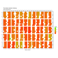
calendarHeatmapPlot
# Create Month Week
df$yearmonth <- as.yearmon(df$date)
df$yearmonthf <- factor(df$yearmonth)
df <- ddply(df,.(yearmonthf), transform, monthweek=1+week-min(week))
df <- df[, c("year", "yearmonthf", "monthf",
"week", "monthweek", "weekdayf", "VIX.Close")]
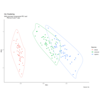
clusterinencirclegPlot
coord_cartesian(xlim = 1.2 * c(min(df_pc$PC1), max(df_pc$PC1)),
ylim = 1.2 * c(min(df_pc$PC2), max(df_pc$PC2))) +
geom_encircle(data = df_pc_vir, aes(x=PC1, y=PC2)) +
geom_encircle(data = df_pc_set, aes(x=PC1, y=PC2)) +
geom_encircle(data = df_pc_ver, aes(x=PC1, y=PC2))
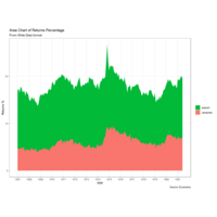
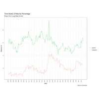
stackedAreaPlot
labs(title="Area Chart of Returns Percentage", subtitle="From Wide Data format", caption="Source: Economics", y="Returns %") + scale_x_date(labels = lbls, breaks = brks) + scale_fill_manual(name="", values = c("psavert"="#00ba38", "uempmed"="#f8766d")) +
theme(panel.grid.minor = element_blank())
timeSeriesPlot
df <- economics_long[economics_long$variable
%in% c("psavert", "uempmed"), ]
df <- df[lubridate::year(df$date) %in% c(1967:1981), ]
# labels and breaks for X axis text
brks <- df$date[seq(1, length(df$date), 12)]
lbls <- lubridate::year(brks)
ggmarginalhistsogramPlot
# Set relative size of marginal plots (main plot 10x bigger than marginals)
ggMarginal(p, type="histogram", size=10)
# Custom marginal plots:
ggMarginal(p, type="histogram", fill = "slateblue", xparams = list( bins=10))
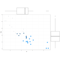
ggMarginalBoxPlot
# Set relative size of marginal plots (main plot 10x bigger than marginals)
ggMarginal(p, type="histogram", size=10)
# Custom marginal plots:
ggMarginal(p, type="histogram", fill = "slateblue", xparams = list( bins=10))
# Show only marginal plot for x axis
ggMarginal(p, margins = 'x', color="purple", size=4)
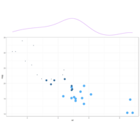
ggMarginalDensPlot
# Show only marginal plot for x axis
ggMarginal(p, margins = 'x', color="purple", size=4)
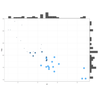
ggMarginalhistPlot
ggMarginal(g, type = "histogram", fill="transparent")
ggMarginal(g, type = "boxplot", fill="transparent")
# ggMarginal(g, type = "density", fill="transparent")
ggMarginalPlot
gMarginal(g, type = "histogram", fill="transparent")
ggMarginal(g, type = "boxplot", fill="transparent")
# ggMarginal(g, type = "density", fill="transparent")
geomgPlot
# plot
ggplot(data=iris, aes(x=Sepal.Length, Petal.Length)) +
geom_point() +
geom_rug(col="steelblue",alpha=0.1, size=1.5)
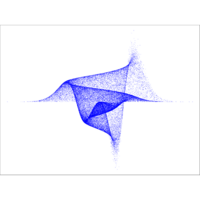
multidimPlot
r = moxbuller(50000)
par(bg="white")
par(mar=c(0,0,0,0))
plot(r$x,r$y, pch=".", col="blue", cex=1.2)
prettyBubblePlot
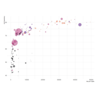
data %>%arrange(desc(pop)) %>%mutate(country = factor(country, country)) %>%ggplot(aes(x=gdpPercap, y=lifeExp, size=pop, fill=continent)) +scale_fill_viridis(discrete=TRUE, guide=FALSE, option="A")
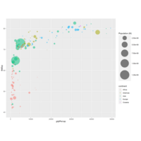
scaleSizePlot
data %>%
arrange(desc(pop)) %>%
mutate(country = factor(country, country)) %>%
ggplot(aes(x=gdpPercap, y=lifeExp, size=pop, color=continent)) +
geom_point(alpha=0.5) +
scale_size(range = c(.1, 24), name="Population (M)")
ggplotjitterPlot
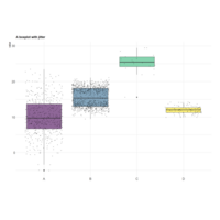
ggplot( aes(x=name, y=value, fill=name)) +geom_boxplot() + scale_fill_viridis(discrete = TRUE, alpha=0.6) +geom_jitter(color="black", size=0.4, alpha=0.9) +theme_ipsum() +theme( legend.position="none", plot.title = element_text(size=11) ) +ggtitle("A boxplot with jitter") + xlab("")
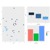
ggplotGridArrangePlot
g3 <- ggplot(mtcars, aes(x=factor(cyl), y=qsec, fill=cyl)) + geom_boxplot() + theme(legend.position="none")
g4 <- ggplot(mtcars , aes(x=factor(cyl), fill=factor(cyl))) + geom_bar()
grid.arrange(g2, arrangeGrob(g3, g4, ncol=2), nrow = 2)
grid.arrange(g1, g2, g3, nrow = 3)
scatterCylinderPlot
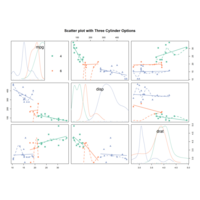
scatterplotMatrix(~mpg+disp+drat|cyl, data=data , reg.line="" , smoother="", col=my_colors , smoother.args=list(col="grey") , cex=1.5 , pch=c(15,16,17) , main=" ")
corrMtcarsPlot
#Correlation matrix with ggally
# Data: numeric variables of the native mtcars dataset
data <- mtcars[ , c(1,3:6)]
# Plot
plot(data , pch=20 , cex=1.5 , col="#69b3a2")
corrgramPlot
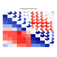
corrgram(mtcars, order=TRUE, lower.panel=panel.shade, upper.panel=panel.pie, text.panel=panel.txt, main="Car Milage Data in PC2/PC1 Order")
corrEllipsePlot
library(ellipse) library(RColorBrewer)
# Use of the mtcars data proposed by R
data <- cor(mtcars)
my_colors <- brewer.pal(5, "Spectral")
my_colors <- colorRampPalette(my_colors)(100)
ord <- order(data[1, ])
data_ord <- data[ord, ord]
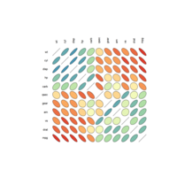
plotcorr(data_ord , col=my_colors[data_ord*50+50] ,
mar=c(1,1,1,1) )
correlationVariablesPlot
# Quick display of two cabapilities of GGally, to assess the distribution and correlation of variables library(GGally)
# From the help page:
data(tips, package = "reshape")
ggpairs(
tips[, c(1, 3, 4, 2)],
upper = list(continuous = "density", combo = "box_no_facet"),
lower = list(continuous = "points", combo = "dot_no_facet")
)
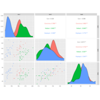
correlationMatrixggallyPlot
# Quick display of two cabapilities of GGally, to assess the distribution and correlation of variables
library(GGally)
# From the help page:
data(flea)
ggpairs(flea, columns = 2:4, ggplot2::aes(colour=species))
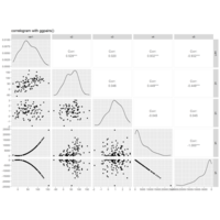
correlationMatrixPlot
data <- data.frame( var1 = 1:100 + rnorm(100,sd=20),
v2 = 1:100 + rnorm(100,sd=27), v3 = rep(1, 100) +
rnorm(100, sd = 1))
data$v4 = data$var1 ** 2
data$v5 = -(data$var1 ** 2)
ggpairs(data, title="correlogramGgpairs()")
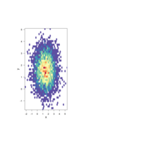
hexbinPlot
bin<-hexbin(x, y, xbins=40)
my_colors=colorRampPalette
(rev(brewer.pal(11,'Spectral')))
plot(bin, main="" , colramp=my_colors , legend=F )
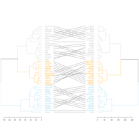
tanglegramPlot
# Plot them together
tanglegram(dl,
common_subtrees_color_lines = FALSE, highlight_distinct_edges = TRUE, highlight_branches_lwd=FALSE,
margin_inner=7,
lwd=2
)
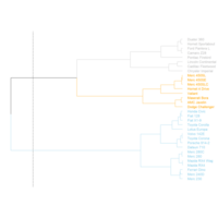
dendextendPlot
# Color in function of the cluster
par(mar=c(1,1,1,7))
dend %>%
set("labels_col", value = c("skyblue", "orange", "grey"), k=3) %>%
set("branches_k_color", value = c("skyblue", "orange", "grey"), k = 3) %>%
plot(horiz=TRUE, axes=FALSE)
abline(v = 350, lty = 2)
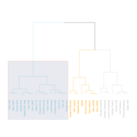
dendrogramPlot
dend %>%
set("labels_col", value = c("skyblue", "orange", "grey"), k=3) %>%
set("branches_k_color", value = c("skyblue", "orange", "grey"), k = 3) %>%
plot(axes=FALSE)
rect.dendrogram( dend, k=3, lty = 5, lwd = 0, x=1, col=rgb(0.1, 0.2, 0.4, 0.1) )
gapmindHTML
library(ggplot2)
library(plotly)
library(gapminder)
p <- gapminder %>%
filter(year==1977) %>%
ggplot( aes(gdpPercap, lifeExp, size = pop, color=continent)) +
geom_point() +
theme_bw()
ggplotly(p)
ggridges2Plot
ggplot(lincoln_weather, aes(x = `Mean Temperature [F]`,
y = `Month`, fill = ..x..)) +geom_density_ridges_gradient
(scale = 3, rel_min_height = 0.01) +scale_fill_viridis
(name = "Temp. [F]", option = "C") +
labs(title = 'Temperatures in Lincoln NE in 2016') +
theme_ipsum() +theme(legend.position="none",
panel.spacing = unit(0.1, "lines"),strip.text.x = element_text(size = 8))
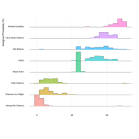
ggridges1Plot
# Plot
data %>%
mutate(text = fct_reorder(text, value)) %>%
ggplot( aes(y=text, x=value, fill=text)) +
geom_density_ridges(alpha=0.6, stat="binline", bins=20) +
theme_ridges() +
theme(
legend.position="none",
panel.spacing = unit(0.1, "lines"),
strip.text.x = element_text(size = 8)
) +
xlab("") +
ylab("Assigned Probability (%)")
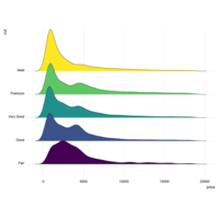
ggridgesPlot
# library
library(ggridges)
library(ggplot2)
# Diamonds dataset is provided by R natively
#head(diamonds)
# basic example
ggplot(diamonds, aes(x = price, y = cut, fill = cut)) +
geom_density_ridges() +
theme_ridges() +
theme(legend.position = "none")

wordCloudStarHTML
wordcloud2(demoFreq, size = 0.7, shape = 'star')
# Change the shape using your image
wordcloud2(demoFreq,
figPath = "gallery/img/other/peaceAndLove.jpg", size = 1.5, color = "skyblue", backgroundColor="black")

wordCloud21HTML
wordcloud2(demoFreq, size=1.6, color=rep_len( c("green","blue"), nrow(demoFreq) ) )wordcloud2(demoFreq, size=1.6, color='random-light')

wordCloud2HTML
# library
library(wordcloud2)
# wordcloud
wordcloud2(demoFreq, size = 2.3, minRotation = -pi/6, maxRotation = -pi/6, rotateRatio = 1)
worldCloudHTML
worldCloud2
# wordcloud
wordcloud2(demoFreqC, size = 2,
fontFamily = "FranklinGothic Medium",
color = "random-light",
backgroundColor = "grey")
radarColorPlot
radarchart( data[-c(1,2),] , axistype=0 , maxmin=F,
#custom polygon
pcol=colors_border , pfcol=colors_in , plwd=4 , plty=1,
#custom the grid
cglcol="grey", cglty=1, axislabcol="black", cglwd=0.8,
#custom labels
vlcex=0.8
)
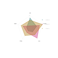
radarchartPlot
radarchart( data , axistype=1 ,
#custom polygon
pcol=colors_border , pfcol=colors_in , plwd=4 , plty=1,
#custom the grid
cglcol="grey", cglty=1, axislabcol="grey", caxislabels=seq(0,20,5), cglwd=0.8,
#custom labels
vlcex=0.8
)
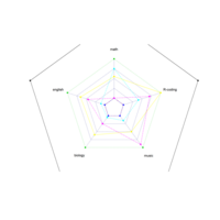
radarPlot
# Library
library(fmsb)
# Create data: note in High school for several students
set.seed(99)
data <- as.data.frame(matrix( sample( 0:20 , 15 , replace=F) , ncol=5))
colnames(data) <- c("math" , "english" , "biology" , "music" , "R-coding" )
rownames(data) <- paste("mister" , letters[1:3] , sep="-")
# To use the fmsb package, I have to add 2 lines to the
data <- rbind(rep(20,5) , rep(0,5) , data)
# plot with default options:
radarchart(data)
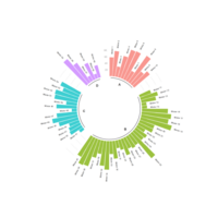
addBaseLinePlot
# prepare a data frame for grid (scales)
grid_data <- base_data
grid_data$end <- grid_data$end[ c( nrow(grid_data), 1:nrow(grid_data)-1)] + 1
grid_data$start <- grid_data$start - 1
grid_data <- grid_data[-1,]
# Make the plot
p <- ggplot(data, aes(x=as.factor(id), y=value, fill=group)) +
geom_segment(data=grid_data, aes(x = end, y = 80, xend = start, yend = 80), colour = "grey", alpha=1, size=0.3 , inherit.aes = FALSE ) +
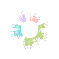
circularBarplotPlot
ggplot(data, aes(x=as.factor(id), y=value, fill=group)) +
geom_bar(stat="identity", alpha=0.5) + ylim(-100,120) +
theme_minimal() +theme(
axis.text = element_blank(),
axis.title = element_blank(),
panel.grid = element_blank(),
plot.margin = unit(rep(-1,4), "cm")
) +coord_polar() + geom_text(data=label_data, aes(x=id, y=value+10, label=individual, hjust=hjust), color="black", fontface="bold",alpha=0.6, size=2.5, angle= label_data$angle, inherit.aes = FALSE )
circleBarPlotPlot
p <- ggplot(data, aes(x=as.factor(id), y=value)) +
geom_bar(stat="identity", fill=alpha("cyan", 0.7)) +
ylim(-100,120) +
theme_minimal() +
theme(
axis.text = element_blank(),
axis.title = element_blank(),
panel.grid = element_blank(),
plot.margin = unit(rep(-1,4), "cm")
) +
coord_polar(start = 0) +
geom_text(data=label_data, aes(x=id, y=value+10, label=individual, hjust=hjust), color="black", fontface="bold",alpha=0.6, size=2.5, angle= label_data$angle, inherit.aes = FALSE )
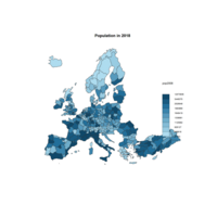
ggraphPlot
ggraph(mygraph, layout = 'dendrogram', circular = TRUE) +
geom_node_point(aes(filter = leaf, x = x*1.05, y=y*1.05)) +
geom_conn_bundle(data = get_con(from = from, to = to), alpha=0.2, colour="skyblue", width=0.9) +
geom_node_text(aes(x = x*1.1, y=y*1.1, filter = leaf, label=name, angle = angle, hjust=hjust), size=1.5, alpha=1) +
theme_void() +
theme(
legend.position="none",
plot.margin=unit(c(0,0,0,0),"cm"),
) +
expand_limits(x = c(-1.2, 1.2), y = c(-1.2, 1.2))
cartographyPlot
choroLayer(spdf = nuts2.spdf, df = nuts2.df, var = "cagr",
breaks = c(-2.43, -1, 0, 0.5, 1, 2, 3.1), col = cols,
border = "grey40", lwd = 0.5, legend.pos = "right",
legend.title.txt = "taux de croissance\nannuel moyen",
legend.values.rnd = 2, add = TRUE)
# Add borders
plot(nuts0.spdf, border = "grey20", lwd = 0.75, add = TRUE)
# Add titles, legend ...
layoutLayer(title = "Growth rate in Europe",
author = "cartography", sources = "Eurostat, 2008",
frame = TRUE, col = NA, scale = NULL, coltitle = "black",
south = TRUE)
InteractivePlotHTML
p <- data %>%
ggplot() +
geom_polygon(data = UK, aes(x=long, y = lat, group = group), fill="grey", alpha=0.3) +
geom_point(aes(x=long, y=lat, size=pop, color=pop, text=mytext, alpha=pop) ) +
scale_size_continuous(range=c(1,15)) +
scale_color_viridis(option="inferno", trans="log" ) +
scale_alpha_continuous(trans="log") +
theme_void() +
ylim(50,59) +
coord_map() +
theme(legend.position = "none")
p <- ggplotly(p, tooltip="text")
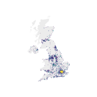
geomPlot
data %>%
arrange(desc(pop)) %>%
mutate( name=factor(name, unique(name))) %>%
ggplot() +
geom_polygon(data = UK, aes(x=long, y = lat, group = group), fill="grey", alpha=0.3) +
geom_point( aes(x=long, y=lat, size=pop, color=pop), alpha=0.9) +
scale_size_continuous(range=c(1,12)) +
scale_color_viridis(trans="log") +
theme_void() + ylim(50,59) + coord_map() + theme(legend.position="none")
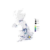
polygonPlot
ggplot() +
geom_polygon(data = UK, aes(x=long, y = lat, group = group), fill="grey", alpha=0.3) +
geom_point( data=data, aes(x=long, y=lat, size=pop, color=pop)) +
scale_size_continuous(range=c(1,12)) +
scale_color_viridis(trans="log") +
theme_void() + ylim(50,59) + coord_map()
mapprojPlot
library(ggrepel)
ggplot() + geom_polygon(data = UK, aes(x=long, y = lat, group = group), fill="grey", alpha=0.3) +geom_point( data=data, aes(x=long, y=lat, alpha=pop)) +
geom_text_repel( data=data %>% arrange(pop) %>% tail(10), aes(x=long, y=lat, label=name), size=5) + geom_point( data=data %>% arrange(pop) %>% tail(10), aes(x=long, y=lat), color="red", size=3) +theme_void() + ylim(50,59) + coord_map() +theme(legend.position="none")
worldConnectionPlot
# map 3 connections:
great <- getGreatCircle(Paris, Melbourne)
lines(great, col="skyblue", lwd=2)
great <- getGreatCircle(Buenos_aires, Melbourne)
lines(great, col="skyblue", lwd=2)
great <- getGreatCircle(Paris, Buenos_aires)
lines(great, col="skyblue", lwd=2)
points(x=data$long, y=data$lat, col="slateblue", cex=3, pch=20)
text(rownames(data), x=data$long, y=data$lat, col="slateblue", cex=1, pos=4)
addeveryconnectionPlot
# add every connections:
for(i in 1:nrow(all_pairs)){
plot_my_connection(all_pairs$long1[i], all_pairs$lat1[i], all_pairs$long2[i], all_pairs$lat2[i], col="skyblue", lwd=1)
}
# add points and names of cities
points(x=data$long, y=data$lat, col="slateblue", cex=2, pch=20)
text(rownames(data), x=data$long, y=data$lat, col="slateblue", cex=1, pos=4)
rcombinePlot
# add every connections:
for(i in 1:nrow(all_pairs)){
plot_my_connection(all_pairs$long1[i], all_pairs$lat1[i], all_pairs$long2[i], all_pairs$lat2[i], col="skyblue", lwd=1)
}
# add points and names of cities
points(x=data$long, y=data$lat, col="slateblue", cex=2, pch=20)
text(rownames(data), x=data$long, y=data$lat, col="slateblue", cex=1, pos=4)

circleConnectionPlot
# Circles for cities
points(x=data$long, y=data$lat, col="slateblue", cex=3, pch=20)
# Connections
plot_my_connection(Paris[1], Paris[2], Melbourne[1], Melbourne[2], col="slateblue", lwd=2)
plot_my_connection(Buenos_aires[1], Buenos_aires[2], Melbourne[1], Melbourne[2], col="slateblue", lwd=2)
plot_my_connection(Buenos_aires[1], Buenos_aires[2], Paris[1], Paris[2], col="slateblue", lwd=2)

adddot&LinePlot
# Dot for cities
points(x=data$long, y=data$lat, col="slateblue", cex=3, pch=20)
# Compute the connection between Buenos Aires and Paris
inter <- gcIntermediate(Paris, Buenos_aires, n=50, addStartEnd=TRUE, breakAtDateLine=F)
# Show this connection
lines(inter, col="slateblue", lwd=2)

connectionMap1Plot
getGreatCircle <- function(userLL,relationLL){
tmpCircle = greatCircle(userLL,relationLL, n=200)
start = which.min(abs(tmpCircle[,1] - data.frame(userLL)[1,1]))
end = which.min(abs(tmpCircle[,1] - relationLL[1]))
greatC = tmpCircle[start:end,]
return(greatC)
}
WorldImageryHTML
# Background 2: World Imagery
m <- leaflet() %>%
addTiles() %>%
setView( lng = 2.34, lat = 48.85, zoom = 3 ) %>%
addProviderTiles("Esri.WorldImagery")
m
nasaHTML
# Background 1: NASA
m <- leaflet() %>%
addTiles() %>%
setView( lng = 2.34, lat = 48.85, zoom = 5 ) %>%
addProviderTiles("NASAGIBS.Night2012")
m
leafletHTML
# Load the library
library(leaflet)
# Initialize the leaflet map with the leaflet() function
m <- leaflet()
# Then we Add default OpenStreetMap map tiles
m <- addTiles(m)
m
# Same stuff but using the %>% operator
m <- leaflet() %>%
addTiles()
m

mapDataPlot
# help(package='mapdata')
map('japan',col="black", lwd=1, mar=rep(0,4))
map('china',col="#69b3a2", lwd=1, mar=rep(0,4))
#map('america',col="black", lwd=1, mar=rep(0,4))
help(packages='mapdata')

MapAustraliaPlot
# Load library
library(oz)
# Check all available geospatial objects:
# help(package='oz')
# Map of Australia
par(mar=rep(0,4))
oz( states=TRUE, col="#69b3a2")
mapAppPlot
lwd=0.05, mar=rep(0,4),border=1, ylim=c(-80,80) )
# Load library
install.packages("mapdata")
# Map of Japan:
map('japan',col="black", lwd=1, mar=rep(0,4))
help(packages='mapdata')

mapdataPlot
# Load library
library(mapdata)
# Check all available geospatial objects:
# help(package='mapdata')
# Map of Japan:
map('japan',col="black", lwd=1, mar=rep(0,4) )
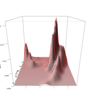
persprotPlot
quak.dens <- kde2d(x=quakes$long,y=quakes$lat,n=50)
persprot(x=quak.dens$x,y=quak.dens$y,
z=quak.dens$z,border="red3",shade=0.4,
ticktype="detailed",xlab="Longitude",ylab="Lati",
zlab="Kernel estimate")
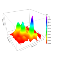
colorPerspPlot
persp(chor.dens.WIN$x,chor.dens.WIN$y, chor.dens.WIN$z,
border=NA, col=rbow[zf.colors],theta=-30,phi=30,
scale=FALSE,expand=750,xlab="Eastings (km)",
ylab="Northings (km)",zlab="Kernel estimate")
colorlegend(col=rbow, zlim=range
(chor.dens.WIN$z,na.rm=TRUE),
zval=seq(0,0.02,0.0025),main="KDE",
digit=4,posx=c(0.85,0.87),posy=c(0.2,0.8))
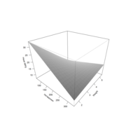
carperspPlot
persp(x=hp.seq,y=wt.seq,z=car.pred.mat,
theta=40,phi=30,ticktype="detailed",
xlab="Horsepower",ylab="Weight",
zlab="mean MPG")
persp(x=hp.seq,y=wt.seq,z=car.pred.mat,
theta=40,phi=30,ticktype="detailed",
shade=0.6,border=NA,expand=0.8,
xlab="Horsepower",ylab="Weight",
zlab="mean MPG")
perspPlot
persp(x=hp.seq,y=wt.seq,z=car.pred.mat,
theta=-30,phi=23,
xlab="Horsepower",ylab="Weight",
zlab="mean MPG")
perspectivePlot
hp.seq <- seq(min(mtcars$hp),max(mtcars$hp),
length=len)
wt.seq <- seq(min(mtcars$wt),max(mtcars$wt),
length=len)
hp.wt <- expand.grid(hp=hp.seq,wt=wt.seq)
car.pred.mat <- matrix(predict(car.fit,newdata=hp.wt),
nrow=len,ncol=len)
persp(x=hp.seq,y=wt.seq,z=car.pred.mat)
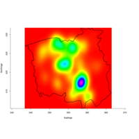
shapecolorlegendPlot
#shape package for colorlegend
par(mar=c(5,4,4,7))
image(chor.dens.WIN$x,
chor.dens.WIN$y,
chor.dens.WIN$z,
col=rbow,xlab="Eastings",
ylab="Northings",bty="l",asp=1)
plot(chor.WIN,lwd=2,add=TRUE)
colorlegend(col=rbow,zlim=range
(chor.dens.WIN$z,na.rm=TRUE),
zval=seq(0,0.02,0.0025),main="KDE",
digit=4,posx=c(0.85,0.87))
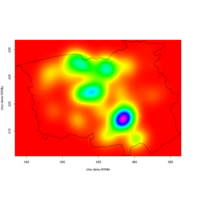
insideowinPlot
chor.dens.WIN <- kde2d(chorley$x,chorley$y,n=256,
lims=c(WIN.xr,WIN.yr))
image(chor.dens.WIN$x,chor.dens.WIN$y,
chor.dens.WIN$z,col=rbow)
plot(chor.WIN,add=TRUE)
inside.owin(x=c(355,345),
y=c(420,415),w=chor.WIN)
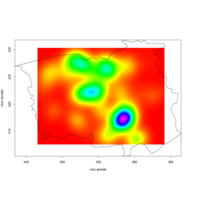
chordensPlot
chor.dens <- kde2d(x=chorley$x,y=chorley$y,n=256)
rbow <- rainbow(200,start=0,end=5/6)
image(x=chor.dens$x,y=chor.dens$y,
z=chor.dens$z,col=rbow)
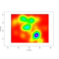
rbowPlot
chor.dens <- kde2d(x=chorley$x,y=chorley$y,n=256)
rbow <- rainbow(200,start=0,end=5/6)
image(x=chor.dens$x,y=chor.dens$y,
z=chor.dens$z,col=rbow)
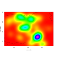
spatstatcholyPlot
chor.dens <- kde2d(x=chorley$x,y=chorley$y,n=256)
rbow <- rainbow(200,start=0,end=5/6)
image(x=chor.dens$x,y=chor.dens$y,
z=chor.dens$z,col=rbow)

spatstatPlot
chor.dens <- kde2d(x=chorley$x,y=chorley$y,n=256)
rbow <- rainbow(200,start=0,end=5/6)
image(x=chor.dens$x,y=chor.dens$y,
z=chor.dens$z,col=rbow)
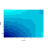
cyanpixelPlot
blues<-colorRampPalette
(c("cyan","navyblue"))
par(mar=c(5,4,4,5)) image(hp.seq,wt.seq,
car.pred.mat,col=blues(10),
xlab="Horsepower",ylab="Weight")
colorlegend(col=blues(10),
zlim=range(car.pred.mat),
zval=seq(10,30,5),
main="Mean\nMPG")
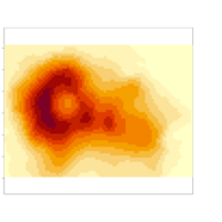
pixelimagePlot
The built-in image function plots pixel images.
Much as with contour,you supply your x- and y-axis
coordinates with z-matrix.
image(x=1:nrow(volcano),
y=1:ncol(volcano),
z=volcano,asp=1)
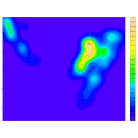
aphaPlot
filled.contour(x=quak.dens$x,y=quak.dens$y,
z=quak.dens$z,color.palette=topo.colors,
nlevels=30,xlab="Longitude",ylab="Latitude",
key.title=title(main="KDE",cex.main=0.3),
plot.axes={axis(1);axis(2);
points(quakes$long,quakes$lat,cex=0.5,
col=adjustcolor("black",alpha=0.1))})

filldensPlot
filled.contour(x=quak.dens$x,y=quak.dens$y,
z=quak.dens$z,color.palette=topo.colors,
nlevels=30,xlab="Longitude",
ylab="Latitude",key.title=title(main="KDE",
cex.main=0.8),plot.axes={axis(1);axis(2);
points(quakes$long,quakes$lat,cex=0.5,
col=adjustcolor("black",alpha=0.3))})
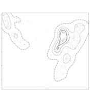
quakdensPlot
contour(quak.dens$x,quak.dens$y,
quak.dens$z,
add=TRUE,levels=quak.levs,
drawlabels=FALSE,lty=4:1,lwd=2)
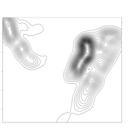
Plot
quak.dens <- kde2d(x=quakes$long,
y=quakes$lat,n=100)
contour(quak.dens$x,quak.dens$y,
quak.dens$z)
contour(quak.dens$x,quak.dens$y,
quak.dens$z,
nlevels=50,drawlabels=FALSE,xaxs="i",
yaxs="i",xlab="Longitude",ylab="Latitude")
points(quakes$long,quakes$lat,cex=0.7)
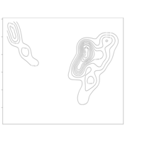
Plot
quak.dens <- kde2d(x=quakes$long,
y=quakes$lat,n=100)
contour(quak.dens$x,quak.dens$y,
quak.dens$z)
contour(quak.dens$x,quak.dens$y,
quak.dens$z,nlevels=50,drawlabels=FALSE,
xaxs="i",yaxs="i",xlab="Longitude",ylab="Lati")
points(quakes$long,quakes$lat,cex=0.7)
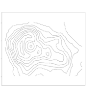
contourPlot
Based on a given numeric z-matrix, the R function
contour is what’s usedto produce
the contours connecting x-y coordinates
that share the samez value.
contour(x=1:nrow(volcano),
y=1:ncol(volcano),
z=volcano,asp=1)
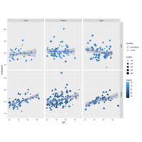
farawayPlot
diab<-na.omit(diabetes[,
c("chol","weight","gender","frame",
"age","height","location")])
ggplot(diab,aes(x=age,y=chol)) +
geom_point(aes(shape=location,
size=weight,col=height)) +
facet_grid(gender~frame) +
geom_smooth(method="lm") +
labs(y="cholesterol")
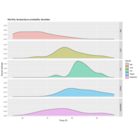
facetGirdHPlot
ggp + facet_grid(Month~.)
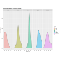
gridfacetPlot
.~ggp <- ggplot(data=air,aes(x=Temp,fill=Month)) + geom_density(alpha=0.4) +
ggtitle("Monthly temperature probability densities") +
labs(x="Temp (F)",y="Kernel estimate")
ggp + facet_wrap(~Month)
ggp + facet_wrap(~Month,scales="free")
ggp + facet_wrap(~Month,nrow=1)
ggp + facet_grid(Month~.)

seperateFacetPlot
ggp <- ggplot(data=air,aes(x=Temp,fill=Month)) + geom_density(alpha=0.4) +
ggtitle("Monthly temperature probability densities") +
labs(x="Temp (F)",y="Kernel estimate")
ggp + facet_wrap(~Month)
ggp + facet_wrap(~Month,scales="free")
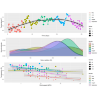
gridExtraPlot
gg2 <- ggplot(air,aes(x=Solar.R,fill=Month)) +
geom_density(alpha=0.4) +
labs(x=expression(paste("Solar radiation (",ring(A),")")),
y="Kernel estimate")
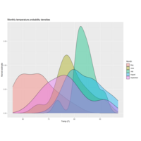
Plot
ggplot(data=air,aes(x=Temp,fill=Month)) + geom_density(alpha=0.4) +
ggtitle("Monthly temperature probability densities") +
labs(x="Temp (F)",y="Kernel estimate")
libraryGGallyPlot
qplot(iris[,4],iris[,3],xlab="Petal width",
ylab="Petal length",
shape=iris$Species)+
scale_shape_manual(values=4:6) +
labs(shape="Species")
ggpairs(iris,mapping=aes(col=Species),
axisLabels="internal")
Plot
qplot(iris[,4],iris[,3],xlab="Petal width",ylab="Petal length",
shape=iris$Species)
+ scale_shape_manual(values=4:6) + labs(shape="Species")
Plot
iris_pch <- rep(19,nrow(iris))
iris_pch[iris$Species=="versicolor"] <- 1
iris_col <- rep("black",nrow(iris))
iris_col[iris$Species=="virginica"] <- "gray"
surfaceHTML
library(plotly)
fig <- plot_ly(
type = 'surface',
contours = list(
x = list(show = TRUE, start = 1.5, end = 2, size = 0.04, color = 'white'),
z = list(show = TRUE, start = 0.5, end = 0.8, size = 0.05)),
x = ~x,
y = ~y,
z = ~z)
fig <- fig %>% layout(
scene = list(
xaxis = list(nticks = 20),
zaxis = list(nticks = 4),
camera = list(eye = list(x = 0, y = -1, z = 0.5)),
aspectratio = list(x = .9, y = .8, z = 0.2)))
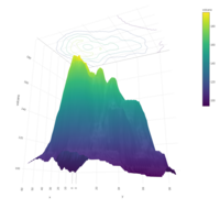
surfaceOpacityHTML
fig <- plot_ly(showscale = FALSE)
fig <- fig %>% add_surface(z = ~z)
fig <- fig %>% add_surface(z = ~z2, opacity = 0.98)
fig <- fig %>% add_surface(z = ~z3, opacity = 0.98)
fig
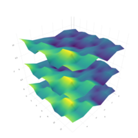
addsurfaceHTML
dim(z) <- c(15,6)
z2 <- z + 1
z3 <- z - 1
fig <- plot_ly(showscale = FALSE)
fig <- fig %>% add_surface(z = ~z)
fig <- fig %>% add_surface(z = ~z2, opacity = 0.98)
fig <- fig %>% add_surface(z = ~z3, opacity = 0.98)
fig
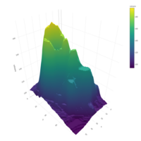
HTML
library(plotly)
# volcano is a numeric matrix that ships with R
fig <- plot_ly(z = ~volcano)
fig <- fig %>% add_surface()
fig
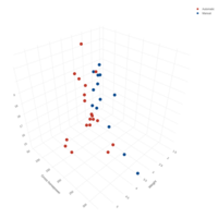
plotly3DHTML
fig <- plot_ly(mtcars, x = ~wt, y = ~hp, z = ~qsec, color = ~am, colors = c('#BF382A', '#0C4B8E'))
fig <- fig %>% add_markers()
fig <- fig %>% layout(scene = list(xaxis = list(title = 'Weight'),
yaxis = list(title = 'Gross horsepower'),
zaxis = list(title = '1/4 mile time')))
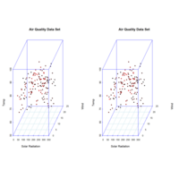
Plot
library(scatterplot3d)
> scatterplot3d(airquality$Solar.R, airquality$Wind,
airquality$Temp, highlight.3d=TRUE, col.axis="blue", col.grid=
"lightblue", main="Air Quality Data Set", pch=20, xlab=
"Solar Radiation", ylab="Wind", zlab="Temp")
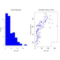
Plot
> par(mfrow=c(1,2))
> hist(airquality$Ozone, xlab="Ozone (ppb)", col="blue", main
="Ozone Frequencies")
> plot(airquality$Ozone, airquality$Temp, pch=16, col="blue",
cex=1.25, xlab="Ozone (ppb)", ylab="Temperature (degrees F)",
main="Air Quality - Ozone vs. Temp", cex.axis=1.5)
> legend(125,60, legend="May-Sep 1973", col="blue", pch=16,
cex=1.0)
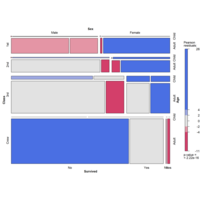
mosaicPlot
library(vcd)
mosaic(~Class+Sex+Age+Survived, data=Titanic, shade=TRUE, legend=TRUE)
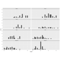
Plot
data(singer, package="lattice")
library(ggplot2)
ggplot(data=singer, aes(x=height))+
geom_histogram()+
facet_wrap(~voice.part, nrow=4)
Plot
data(singer, package="lattice")
library(ggplot2)
ggplot(data=singer, aes(x=height, fill=voice.part))+
geom_density()+
facet_grid(voice.part~.)
BubbleChartPlot
ggplot(mtcars, aes(x=wt, y=mpg, size=disp))+
geom_point(shape=21, color="black", fill="cornsilk")+
labs(x="Weight", y="Miles Per Gallon",
title="Bubble Chart", size="Engine\nDisplacement")
Plot
xyplot(mpg~wt | cyl * gear,
main="Scatter Plots by Cylinders and Gears",
xlab="Car Weight", ylab="Miles per Gallon")
Plot
bwplot(cyl~mpg | gear,
main="Box Plots by Cylinders and Gears",
xlab="Miles per Gallon", ylab="Cylinders")
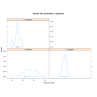
Plot
bwplot(cyl~mpg | gear,
xlab="Miles per Gallon", ylab="Cylinders")
xyplot(mpg~wt | cyl * gear,
xlab="Car Weight", ylab="Miles per Gallon")
cloud(mpg~wt * qsec | cyl,
main="3D Scatter Plots by Cylinders")
dotplot(cyl~mpg | gear,
xlab="Miles Per Gallon")
splom(mtcars[c(1, 3, 4, 5, 6)],
detach(mtcars)
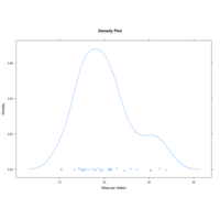
Plot
library(lattice)attach(mtcars)
gear <- factor(gear, levels=c(3, 4, 5),labels=c("3 gears", "4 gears", "5 gears"))
cyl <- factor(cyl, levels=c(4, 6, 8),labels=c("4 cylinders", "6 cylinders", "8 cylinders"))
densityplot(~mpg,main="Density Plot", xlab="Miles per Gallon")
densityplot(~mpg | cyl,xlab="Miles per Gallon")
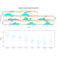
Plot
library(lattice)
graph1 <- histogram(~height | voice.part, data=singer,
main="Heights of Choral Singers by Voice Part" )
graph2 <- bwplot(height~voice.part, data=singer)
plot(graph1, split=c(1, 1, 1, 2))
plot(graph2, split=c(1, 2, 1, 2), newpage=FALSE)
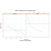
Plot
xyplot(mpg~disp|transmission, data=mtcars,
scales=list(cex=.8, col="red"),
panel=panel.smoother,
xlab="Displacement", ylab="Miles per Gallon",
main="MPG vs Displacement by Transmission Type",
sub="Dotted lines are Group Means", aspect=1)
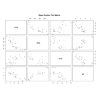
Plot
pairs(~mpg+disp+drat+wt, data=mtcars,
main="Basic Scatter Plot Matrix")
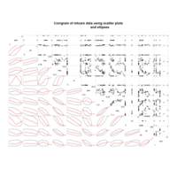
Plot
library(corrgram)
corrgram(mtcars, order=TRUE, lower.panel=panel.ellipse,
upper.panel=panel.pts, text.panel=panel.txt,
diag.panel=panel.minmax,
main="Corrgram of mtcars data using scatter plots
and ellipses")
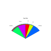
Plot
library(plotrix)
slices <- c(10, 12,4, 16, 8)
lbls <- c("US", "UK", "Australia", "Germany", "France")
fan.plot(slices, labels=lbls, main="Fan Plot")
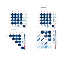
Plot
data.1[1:5,1:5]
cor_data <- cor(data.1, method="pearson")
round(cor_data[1:5,1:5],3)
cor_data <- cor(data.1,method="spearman")
cor_data <- cor(data.1,method="spearman")
round(cor_data[1:5,1:5],3)
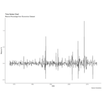
timeserisePlot
# Allow Default X Axis Labels
ggplot(economics, aes(x=date)) +
geom_line(aes(y=returns_perc)) +
labs(title="Time Series Chart",
subtitle="Returns Percentage from 'Economics' Dataset",
caption="Source: Economics",
y="Returns %")
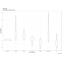
violinPlot
g <- ggplot(mpg, aes(class, cty))
g + geom_violin() +
labs(title="Violin plot",
subtitle="City Mileage vs Class of vehicle",
caption="Source: mpg",
x="Class of Vehicle",
y="City Mileage")
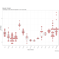
dotplusboxPlot
g <- ggplot(mpg, aes(manufacturer, cty))
g + geom_boxplot() + geom_dotplot(binaxis='y', stackdir='center', dotsize = .5, fill="red") + theme(axis.text.x = element_text(angle=65, vjust=0.6)) + labs(title="Box plot + Dot plot",
subtitle="City Mileage vs Class: data",
caption="Source: mpg",
x="Class of Vehicle",
y="City Mileage")
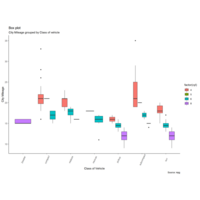
ggthemePlot
library(ggthemes)
g <- ggplot(mpg, aes(class, cty))
g + geom_boxplot(aes(fill=factor(cyl))) +
theme(axis.text.x = element_text(angle=65, vjust=0.6)) +
labs(title="Box plot",
subtitle="City Mileage grouped by Class of vehicle",
caption="Source: mpg",
x="Class of Vehicle",
y="City Mileage")
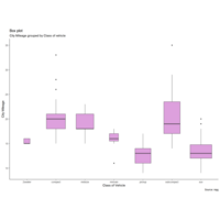
cyanBoxPlot
Box plot is an excellent tool to study the distribution. It can also show the distributions within multiple groups, along with the median, range and outliers if any.
library(ggplot2)
theme_set(theme_classic())
# Plot
g <- ggplot(mpg, aes(class, cty))
g + geom_boxplot(varwidth=T, fill="plum") +
labs(title="Box plot",
subtitle="City Mileage grouped by Class of vehicle",
caption="Source: mpg",
x="Class of Vehicle",
y="City Mileage")
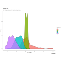
densityPlot
library(ggplot2)
theme_set(theme_classic())
# Plot
g <- ggplot(mpg, aes(cty))
g + geom_density(aes(fill=factor(cyl)), alpha=0.8) +
labs(title="Density plot",
subtitle="City Mileage Grouped by Number of cylinders",
caption="Source: mpg",
x="City Mileage",
fill="# Cylinders")
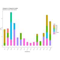
HistogramFrequPlot
Histogram on a categorical variable would result in a frequency chart showing bars for each category. By adjusting width, you can adjust the thickness of the bars.
g <- ggplot(mpg, aes(manufacturer))
g + geom_bar(aes(fill=class), width = 0.5) +
theme(axis.text.x = element_text(angle=65, vjust=0.6)) +
labs(title="Histogram on Categorical Variable",
subtitle="Manufacturer across Vehicle Classes")
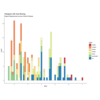
HistogramPlot
g + geom_histogram(aes(fill=class),
binwidth = .1,
col="black",
size=.1) + # change binwidth
labs(title="Histogram with Auto Binning",
subtitle="Engine Displacement across Vehicle Classes")
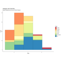
DistributionPlot
g + geom_histogram(aes(fill=class),
bins=5,
col="black",
size=.1) + # change number of bins
labs(title="Histogram with Fixed Bins",
subtitle="Engine Displacement across Vehicle Classes")
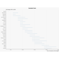
dumbbellPlot
gg <- ggplot(health, aes(x=pct_2013, xend=pct_2014, y=Area, group=Area)) + geom_dumbbell(color="#a3c4dc",
size=0.75,
point.colour.l="#0e668b") +
scale_x_continuous(label=percent) +
labs(x=NULL,
y=NULL,
title="Dumbbell Chart",
subtitle="Pct Change: 2013 vs 2014",
caption="Source: https://github.com/hrbrmstr/ggalt") +
plot(gg)
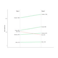
slopchartPlot
p <- ggplot(df) + geom_segment(aes(x=1, xend=2, y=`1952`, yend=`1957`, col=class), size=.75, show.legend=F) +
geom_vline(xintercept=1, linetype="dashed", size=.1) +
geom_vline(xintercept=2, linetype="dashed", size=.1) +
scale_color_manual(labels = c("Up", "Down"),
values = c("green"="#00ba38", "red"="#f8766d")) +
labs(x="", y="Mean GdpPerCap") + # Axis labels
xlim(.5, 2.5) + ylim(0,(1.1*(max(df$`1952`, df$`1957`))))
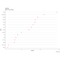
rankingdotPlot
ggplot(cty_mpg, aes(x=make, y=mileage)) +
geom_point(col="tomato2", size=3) + # Draw points
geom_segment(aes(x=make,
xend=make,
y=min(mileage),
yend=max(mileage)),
linetype="dashed",
size=0.1) + # Draw dashed lines
labs(title="Dot Plot",
subtitle="Make Vs Avg. Mileage",
caption="source: mpg") +
coord_flip()
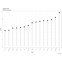
LollipopRankingPlot
ggplot(cty_mpg, aes(x=make, y=mileage)) +
geom_point(size=5) +
geom_segment(aes(x=make,
xend=make,
y=0,
yend=mileage)) +
labs(title="Lollipop Chart",
subtitle="Make Vs Avg. Mileage",
caption="source: mpg") +
theme(axis.text.x = element_text(angle=65, vjust=0.6))
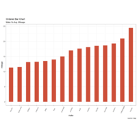
rankingPlot
library(ggplot2)
theme_set(theme_bw())
# Draw plot
ggplot(cty_mpg, aes(x=make, y=mileage)) +
geom_bar(stat="identity", width=.5, fill="tomato3") +
labs(title="Ordered Bar Chart",
subtitle="Make Vs Avg. Mileage",
caption="source: mpg") +
theme(axis.text.x = element_text(angle=65, vjust=0.6))
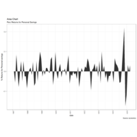
AreaChartPlot
ggplot(economics[1:100, ], aes(date, returns_perc)) +
geom_area() +
scale_x_date(breaks=brks, labels=lbls) +
theme(axis.text.x = element_text(angle=90)) +
labs(title="Area Chart",
subtitle = "Perc Returns for Personal Savings",
y="% Returns for Personal savings",
caption="Source: economics")
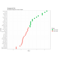
DivergingDotPlot
ggplot(mtcars, aes(x=`car name`, y=mpg_z, label=mpg_z)) +
geom_point(stat='identity', aes(col=mpg_type), size=6) +
scale_color_manual(name="Mileage", +
geom_text(color="white", size=2) +
labs(title="Diverging ", subtitle="Normalized mileage from '
mtcars': Dotplot") + ylim(-2.5, 2.5) +coord_flip()
LollipopPlot
ggplot(mtcars, aes(x=`car name`, y=mpg_z, label=mpg_z)) +
geom_point(stat='identity', fill="black", size=6) +
geom_segment(aes(y = 0,
x = `car name`,
yend = mpg_z,
xend = `car name`),
color = "black") +
geom_text(color="white", size=2) +
labs(title="Diverging Lollipop Chart",
subtitle="Normalized mileage from 'mtcars': Lollipop") +
ylim(-2.5, 2.5) +
coord_flip()
DivergingBarPlot
Compare variation in values between small number of items (or categories) with respect to a fixed reference.
Diverging bars
Diverging Bars is a bar chart that can handle both negative and positive values.
ggCorrplotPlot
# devtools::install_github
("kassambara/ggcorrplot")
# Correlation matrix
data(mtcars)
corr <- round(cor(mtcars), 1)
ggcorrplot(corr, hc.order = TRUE,
type = "lower", lab = TRUE,
lab_size = 3, method="circle",
colors = c("tomato2", "white", "springgreen3"),
title="Correlogram of mtcars",
ggtheme=theme_bw)
Plot
theme_set(theme_bw()) # pre-set the bw theme.
g <- ggplot(mpg_select, aes(displ, cty)) +
labs(subtitle="mpg: Displacement vs City Mileage",
title="Bubble chart")
g + geom_jitter(aes(col=manufacturer, size=hwy)) +
geom_smooth(aes(col=manufacturer), method="lm", se=F)
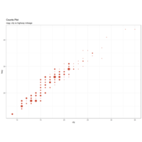
countsPlot
# load package and data
library(ggplot2)
data(mpg, package="ggplot2")
# mpg <- read.csv("http://goo.gl/uEeRGu")
# Scatterplot
theme_set(theme_bw()) # pre-set the bw theme.
g <- ggplot(mpg, aes(cty, hwy))
g + geom_count(col="tomato3", show.legend=F) +
labs(subtitle="mpg: city vs highway mileage",
y="hwy",
x="cty",
title="Counts Plot")
Plot
theme_set(theme_bw()) # pre-set the bw theme.
g <- ggplot(mpg, aes(cty, hwy))
g + geom_jitter(width = .5, size=1) +
labs(subtitle="mpg: city vs highway mileage",
y="hwy",
x="cty",
title="Jittered Points")
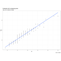
Plot
g + geom_point() +
geom_smooth(method="lm", se=F) +
labs(subtitle="mpg: city vs highway mileage",
y="hwy",
x="cty",
title="Scatterplot with overlapping points",
caption="Source: midwest")
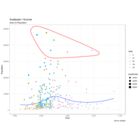
EncircleScatterPlot
# install 'ggalt' pkg
# devtools::install_github("hrbrmstr/ggalt")
options(scipen = 999)
library(ggplot2)
library(ggalt)
midwest_select <- midwest[midwest$poptotal > 350000 &
midwest$poptotal <= 500000 &
midwest$area > 0.01 &
midwest$area < 0.1, ]
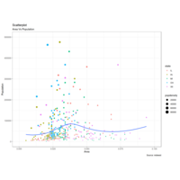
ScatterPlot
# Scatterplot
gg <- ggplot(midwest, aes(x=area, y=poptotal)) +
geom_point(aes(col=state, size=popdensity)) +
geom_smooth(method="loess", se=F) +
xlim(c(0, 0.1)) +
ylim(c(0, 500000)) +
labs(subtitle="Area Vs Population",
y="Population",
x="Area",
title="Scatterplot",
caption = "Source: midwest")
plot(gg)
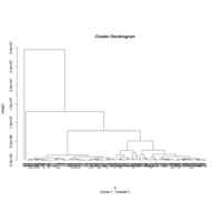
Plot
clustering example
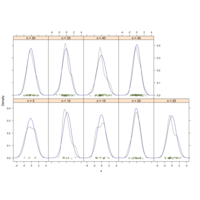
Plot
library(lattice)
n <- seq(5, 45, 5)
x <- rnorm(sum(n))
y <- factor(rep(n, n), labels=paste("n =", n))
densityplot(~ x | y,
panel = function(x, ...) {
panel.densityplot(x, col="DarkOliveGreen", ...)
panel.mathdensity(dmath=dnorm,
args=list(mean=mean(x), sd=sd(x)),
col="darkblue")
})
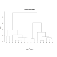
Plot
d=dist(Fintech)
hc1=hclust(d,method="ward.D2") #Sum of Squares of Deviations
hc2=hclust(d,method="single") #Shortest distance method
hc3=hclust(d,method="complete") #Lonest distance method
hc4=hclust(d,method="median") #Middle distance method
Plot
opar=par(mfrow=c(2,2)) #Divide Plotting Area
plot(hc1,hang=-1);plot(hc2,hang=-1);
plot(hc3,hang=-1);plot(hc4,hang=-1)
par(opar) #Release Plotting Area
Plot
library(corrplot)
corrplot(cor_data)
corrplot(cor_data, method="pie",title="method=pie")
corrplot(cor_data, type="upper",title="type=upper")
corrplot.mixed(cor_data,lower="ellipse",
upper="pie")
PlotDiablo1
MyResult.diablo <- block.splsda(X, Y,keepX=list.keepX)
plotIndiv(MyResult.diablo,
ind.names = FALSE,
legend=TRUE, cex=c(1,2,3),
title = 'BRCA with DIABLO')
plotVar(MyResult.diablo, var.names =c(FALSE, FALSE, TRUE),
legend=TRUE, pch=c(16,16,1))
plotDiablo(MyResult.diablo, ncomp = 1)
plotDiablo(MyResult.diablo, ncomp = 1)
PlotDiablo
plotVar(MyResult.diablo, var.names =c(FALSE, FALSE, TRUE),
legend=TRUE, pch=c(16,16,1))
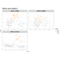
PlotTCGA
data(breast.TCGA)
MyResult.diablo <- block.splsda(X, Y,keepX=list.keepX)
plotIndiv(MyResult.diablo,
ind.names = FALSE,
legend=TRUE, cex=c(1,2,3),
title = 'BRCA with DIABLO')
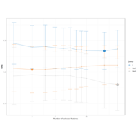
PlotMAE
list.keepX <- c(2:10, 15, 20)
# tuning based on MAE
set.seed(30) # for reproducbility in thisvignette, otherwise increase nrepeat
tune.spls.MAE <- tune.spls(X, Y, ncomp =3,
test.keepX =list.keepX,
validation ="Mfold", folds = 5,
nrepeat = 10,progressBar = FALSE,
measure = 'MAE')
plot(tune.spls.MAE, legend.position = 'topright')

Plotnetwork
network(MyResult.spls, comp = 1)# network(MyResult.spls,comp = 1, cutoff = 0.6, save = 'jpeg', name.save = 'PLSnetwork')
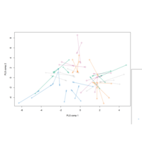
PlotArrow
plotArrow(MyResult.spls,
group=nutrimouse$diet,
legend = TRUE,
X.label = 'PLS comp 1',
Y.label = 'PLS comp 2')
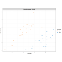
PlotsPLS
plotIndiv(MyResult.spls, group =nutrimouse$genotype,
rep.space = "XY-variate", legend = TRUE,
legend.title = 'Genotype',
ind.names = nutrimouse$diet,
title = 'Nutrimouse: sPLS')
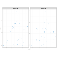
Plotnutrimouse
data(nutrimouse)
X <- nutrimouse$gene
Y <- nutrimouse$lipid
MyResult.spls <- spls(X,Y, keepX = c(25,25), keepY = c(5,5))
plotIndiv(MyResult.spls)
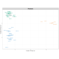
PlotSrbct
data(srbct)
X <- srbct$gene
Y <- srbct$class
MyResult.splsda <- splsda(X, Y, keepX =c(50,50))
plotIndiv(MyResult.splsda)
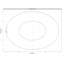
PlotVar
plotVar(MyResult.spca, cex = 1)
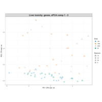
Plotmyr2
MyResult.spca <- spca(X, ncomp = 3,keepX = c(15,10,5)) # 1Run the method
plotIndiv(MyResult.spca, group =liver.toxicity$treatment$Dose.Group, #2 Plot the samples
pch = as.factor(liver.toxicity$treatment$Time.Group),
legend = TRUE, title = 'Liver toxicity: genes, sPCA comp 1 - 2',
legend.title = 'Dose', legend.title.pch = 'Exposure')
Plotmyr
plotLoadings(MyResult.pca, ndisplay = 100, comp=2,
name.var = liver.toxicity$gene.ID[, "geneBank"],
size.name = rel(0.3))
Plotpca
plotLoadings(MyResult.pca)
PlotBiocManager
plotIndiv(MyResult.pca, ind.names = FALSE,
group = liver.toxicity$treatment$Dose.Group,
pch = as.factor(liver.toxicity$treatment$Time.Group),
legend = TRUE, title = 'Liver toxicity: genes, PCA comp 1 - 2',
legend.title = 'Dose', legend.title.pch = 'Exposure')
PlotBubble
library(mixOmics)
data(liver.toxicity)
X <- liver.toxicity$gene
MyResult.pca <- pca(X)
plotIndiv(MyResult.pca, group =liver.toxicity$treatment$Dose.Group, legend = TRUE)
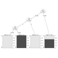
PlotDecisionTree
# Load the party package. It will automatically load other
# dependent packages.
library(party)
# Create the input data frame.
input.dat <- readingSkills[c(1:105),]
# Give the chart file a name.
png(file = "decision_tree.png")
# Create the tree.
output.tree <- ctree(
nativeSpeaker ~ age + shoeSize + score,
data = input.dat)
# Plot the tree.
plot(output.tree)
# Save the file.
dev.off()
Plotting
3 plotting system
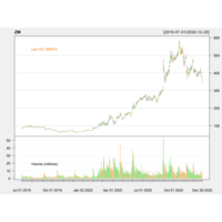
Plot
library(quantmod)
getSymbols("ZM",src="yahoo")
chartSeries(ZM,subset = "2019-07-01::2020-12-28")
addATR()
addBBands(n=14,sd=2)
addCCI()#SPSS Index
addWPR()#William Index
addSAR()#stopandReverse index
addDPO()#RangFlctuateIndex
addRSI()#CompareSW Index
StocPricePrediction
library(quantmod)
getSymbols("BTC/USDT",src="yahoo")
chartSeries(BTC/USDT,subset = "2019-07-01::2020-12-28")
addATR()
addBBands(n=14,sd=2)
addCCI()#SPSS Index
addWPR()#William Index
addSAR()#stopandReverse index
addDPO()#RangFlctuateIndex
addRSI()#CompareSW Index

Reproductive and Replication
## R Markdown
This is an R Markdown document. Markdown is a simple formatting syntax for authoring HTML, PDF, and MS Word documents. For more details on using R Markdown see <http://rmarkdown.rstudio.com>.
When you click the **Knit** button a document will be generated that includes both content as well as the output of any embedded R code chunks within the document.
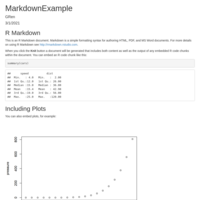
Report
Markdown
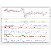
Plot
library(quantmod)
getSymbols("BTC/USDT",src="yahoo")
chartSeries(BTC/USDT,subset = "2019-07-01::2020-12-28")
addATR()
addBBands(n=14,sd=2)
addCCI()#SPSS Index
addWPR()#William Index
addSAR()#stopandReverse index
addDPO()#RangFlctuateIndex
addRSI()#CompareSW Index
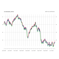
Plot
#Expandable time series xts
library(xts)
data(sample_matrix) # TestDataSet smple_matrix
head(sample_matrix)
plot(sample_matrix)
plot(as.xts(sample_matrix))
plot(as.xts(sample_matrix), type='c')
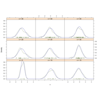
Plot
library(lattice)
n <- seq(5, 45, 5)
x <- rnorm(sum(n))
y <- factor(rep(n, n), labels=paste("n =", n))
densityplot(~ x | y,
panel = function(x, ...) {
panel.densityplot(x, col="DarkOliveGreen", ...)
panel.mathdensity(dmath=dnorm,
args=list(mean=mean(x), sd=sd(x)),
col="darkblue")
})
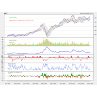
Plot
getSymbols("MSFT",src="yahoo")
chartSeries(MSFT,subset = "2019-07-01::2020-12-31",theme = "white")
addATR()#CompareSW Index
addBBands(n=14,sd=2)
addCCI()#SPSS Index
addWPR()#William Index
addSAR()#stopandReverse index
addDPO()#RangFlctuateIndex
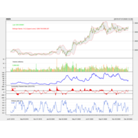
Plot
getSymbols("AMZN",src="yahoo")
chartSeries(AMZN,subset = "2019-07-01::2020-12-28", theme = "white")
addATR()
addBBands(n=14,sd=2)
addCCI()#SPSS Index
addWPR()#William Index
addSAR()#stopandReverse index
addDPO()#RangFlctuateIndex
addRSI()#CompareSW Index
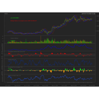
Plot
#AMZNCase
library(quantmod)
getSymbols("AMZN",src="yahoo")
chartSeries(AMZN,subset = "2019-07-01::2020-12-28")
addATR()
addBBands(n=14,sd=2)
addCCI()#SPSS Index
addWPR()#William Index
addSAR()#stopandReverse index
addDPO()#RangFlctuateIndex
addRSI()#CompareSW Index
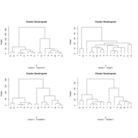
Plot
opar=par(mfrow=c(2,2)) #Divide Plotting Area
plot(hc1,hang=-1);plot(hc2,hang=-1);
plot(hc3,hang=-1);plot(hc4,hang=-1)
par(opar) #Release Plotting Area
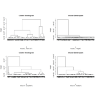
Plot
index heat caffeine Na price
1 207.2 3.3 15.5 2.8
2 36.8 5.9 12.9 3.3
3 72.2 7.3 8.2 2.4
4 36.7 0.4 10.5 4.0
5 121.7 4.1 9.2 3.5
6 89.1 4.0 10.2 3.3
7 146.7 4.3 9.7 1.8
8 57.6 2.2 13.6 2.1
9 95.9 0.0 8.5 1.3
10 199.0 0.0 10.6 3.5
11 49.8 8.0 6.3 3.7
12 16.6 4.7 6.3 1.5
13 38.5 3.7 7.7 2.0
14 0.0 4.2 13.1 2.2
15 118.8 4.7 7.2 4.1
16 107.0 0.0 8.3 4.2

Plot
#add coefficiency
ggcorrplot(cor_data,hc.order=TRUE,
outline.color="white",type="lower",colors = c("#6D9EC1", "white", "#E46726"),lab = TRUE)
ggcorrplot(cor_data,hc.order=TRUE,
outline.color="white",type="lower",colors = c("#6D9EC1", "white", "#E46726"),p.mat = cor_p)
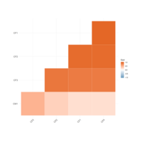
Plot
ggcorrplot(cor_data,hc.order=TRUE,
outline.color="white",type="lower")
##change color
ggcorrplot(cor_data,hc.order=TRUE,
outline.color="white",type="lower",colors = c("#6D9EC1", "white", "#E46726"))
##change theme
ggcorrplot(cor_data,hc.order=TRUE,
outline.color="white",type="lower",colors = c("#6D9EC1", "white", "#E46726"),
ggtheme = ggplot2::theme_void())
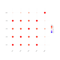
Plot
library(ggcorrplot)
##calculate pValue
cor_p <- cor_pmat(cor_data)
round(cor_p[1:5,1:5],3)
##default square
ggcorrplot(cor_data)
ggcorrplot(cor_data,method="circle")
ggcorrplot(cor_data,hc.order=TRUE,
outline.color="white")
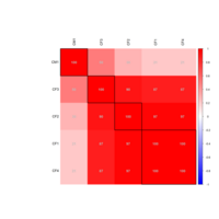
Plot
corrplot(cor_data,method="color",
order="hclust",
addrect=4, col=col1(100),
tl.col="black",addCoef.col="grey",
addCoefasPercent=T)
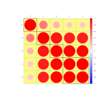
Plot
col1 <- colorRampPalette(c("blue","white","red"))
corrplot(cor_data,order="hclust",addrect=4,
col=col1(100),bg="khaki1",addgrid.col="green",
tl.col="purple",tl.cex=0.7)
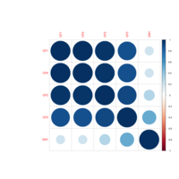
Plot
#hclust.method = c("complete", "ward", "single", "average",
#"mcquitty", "median", "centroid")
corrplot(cor_data,order="hclust",
hclust.method="average",
addrect=4)
corrplot(cor_data,order="AOE")
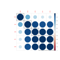
Plot
##order
#"original", "AOE", "FPC", "hclust", "alphabet"
#hclust:
#addrect=4
#rect.col = "black"
#rect.lwd = 2
#hclust.method = c("complete", "ward", "single", "average",
#"mcquitty", "median", "centroid")
corrplot(cor_data,order="hclust",
hclust.method="average",addrect=4)
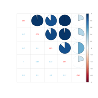
Plot
corrplot.mixed(matrix,lower="number",
upper="circle")
#tl.collower.colnumber.cex
corrplot.mixed(cor_data,lower="number",
upper="pie",
tl.col="red",lower.col="skyblue",number.cex=1)
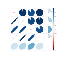
Plot
cor(x,y=NULL,use="everything",method= c("pearson","kendall","spearman"))
cor(x, use='everything', method='pearson')
cor(mtcars$mpg, mtcars$cyl)
corrplot.mixed(cor_data,lower="number",
upper="pie", tl.col="green",
lower.col="skyblue",number.cex=1)
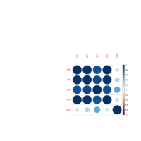
Plot
corrplotExample
#"circle", "square", "ellipse", "number", "shade", "color", "pie"
corrplot(cor_data, method="pie",title="method=pie")
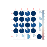
Plot
corrplot(corr, method = c("circle", "square", "ellipse", "number", "shade", "color", "pie"),
type = c("full", "lower", "upper"), add = FALSE, col = NULL, bg = "white",
title = "", is.corr = TRUE, diag = TRUE, outline = FALSE, mar = c(0,0,0,0),
addgrid.col = NULL, addCoef.col = NULL, addCoefasPercent = FALSE
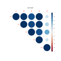
corPlot
corrplot(corr,
method = c("circle", "square", "ellipse", "number", "shade", "color", "pie"), addCoef.col = NULL, addCoefasPercent = FALSE, order = c("original", "AOE", "FPC", "hclust", "alphabet"), plotCI = c("n","square", "circle", "rect"), lowCI.mat = NULL, uppCI.mat = NULL, ...)