
gmkumar1988
Mahesh Gurumoorthi
Recently Published

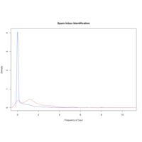
IMDB Descriptive Statistics In Detail
The problem statement focuses on analyzing IMDb scores by leveraging details from IMDb votes found in a Kaggle dataset. IMDb scores represent the overall user rating of a movie, typically ranging from 1 to 10, based on individual user votes. These votes capture audience reactions, preferences, and perceptions of a film’s quality.

Reproducible Research Assignment 02
Reproducibleresearch02


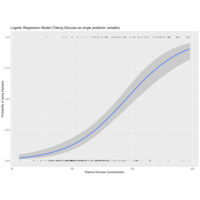
Youth Literacy Rate Ratio Age Between 15 to 24
This plot summarize the literacy rate ratio of age between 15 to 24
Machinelearning Prediction Assignment Write Up
Coursera Machine Learning Assignment

Decision Tree using Rattle Package
Sample Iris decision tree using rattle package

Shiny Application Reproducible Pitch
Shiny Application Reproducible Pitch
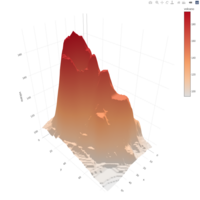
Volcano View
Plotly using volcano dataset
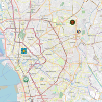
Leaflet - University View
Leaflet package is used to create google maps
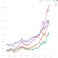
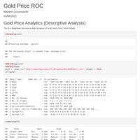
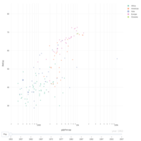
Gold Stock Price Descriptive Analysis
Business Case : Provide the gold price using descriptive methods and show it using ROC view point (Data View Plotted from 2017 onwards)
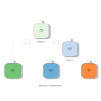
Employee Organisation
Explains about the organisation
GDP Percapita - Plotly R
GDP Percapita Using Plotly package with inbuild gapminder package
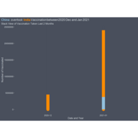
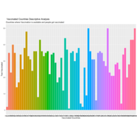
Country Vaccination Plot Descriptive Analysis
Descriptive Analysis using ggplot package
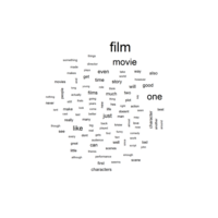
Text Mining - Movie Reviews
Text Mining - OTT Movie Reviews
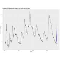
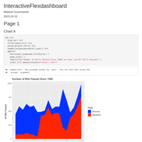
Forecasting Of Unemployment Rate in USA for the next 50 years
Below methods are used statistically for Benchmark purpose
Seasonal Naive Model
Fit ETS Model
ARIMA model
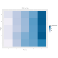
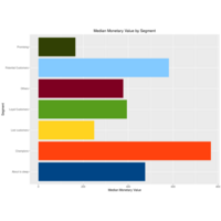
RFM Analysis for E- Commerce Data Set
This gives the detailed analysis about customers with respect to purchase
RFM Analysis for E- Commerce Data Set
This plot gives the frequency of each customers and clustered into loyal vs not satisfied customers
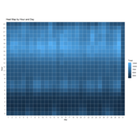
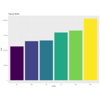
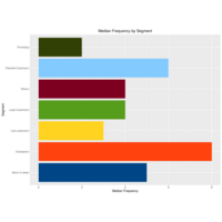
Uber Analysis
Learning Project
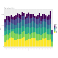
Uber Analysis
Learning purpose
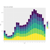
Uber Analysis
This data analysis is taken from the website data flair and this is only for learning purpose.
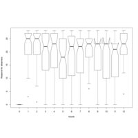
Month Wise Absenteism Using Box Plot and Notch
data = read.csv("F://Sample CSV Files for statistics//Absenteeism_work.csv",header = T)
> head(data)
ID Reason.for.absence Month.of.absence Day.of.the.week Seasons Age Absenteeism.time.in.hours
1 11 26 7 3 1 33 4
2 36 0 7 3 1 50 0
3 3 23 7 4 1 38 2
4 7 7 7 5 1 39 4
5 11 23 7 5 1 33 2
6 3 23 7 6 1 38 NA
> boxplot(factor,data$Absenteeism.time.in.hours,notch = T, xlab = "Month", ylab = "Time of Absenteism")
Plot
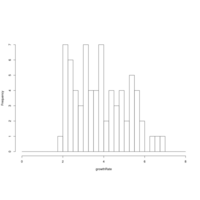
Histogram of Growth rate in Diaphenia